


Pouch Issue 2, ft the musical stylings of Popeye and Cat-sensei
I'm learning how to make a magazine!

Hello friends!
In case you missed the announcement, Pouch Issue #2 is out now!! YAYYY!!
I LOVE Pouch Issue 2. Of course, Issue 1 holds so much sentimental value for me — the first issue! an ambitious new project!! a dream come true!! Truthfully, I didn’t expect to love the second issue quite as much.
But oh man was I wrong: Pouch Issue 2 is really, really special to me, and today I want to try to explain why. I’m going to take you behind the scenes of making this issue, with a particular focus on a few BIG mistakes I made along the way 😆 and how despite (or because of??) the challenges, the issue came together. I want to talk about the mistakes, not because I’m trying to dwell on the negatives, but it’s because I think it’s this struggle — and SUBSEQUENT TRIUMPHANT CONCLUSION — that makes Pouch #2 near and dear to my heart 💖
So that’s today’s topic!! But before I get into that, a few announcements:
🎊 Pouch Issue #2 is OUT NOW!! OK, I just said this but I figured it deserved a bullet point lolll. You can order your copy today~!
🥳 We’ve throwing a Pouch Launch Party!! Come eat snacks, swap stationery, and meet other stationery lovers at Orion Bar on Wed April 16th, 2025 from 7pm - 9pm. (You can also pick up Pouch Issue 2 in person if you’re local and you want to save on shipping!) Details and RSVP here~!
Alright, onto the joys, angsts, frustrations, and ELATION of making an indie magazine, as a team of mostly one1, with no budget, and with no prior experience in graphic design or making a magazine2 😂
I hope you enjoy today’s newsletter! 🩵
♡ vrk
💬 Feedback from Issue #1
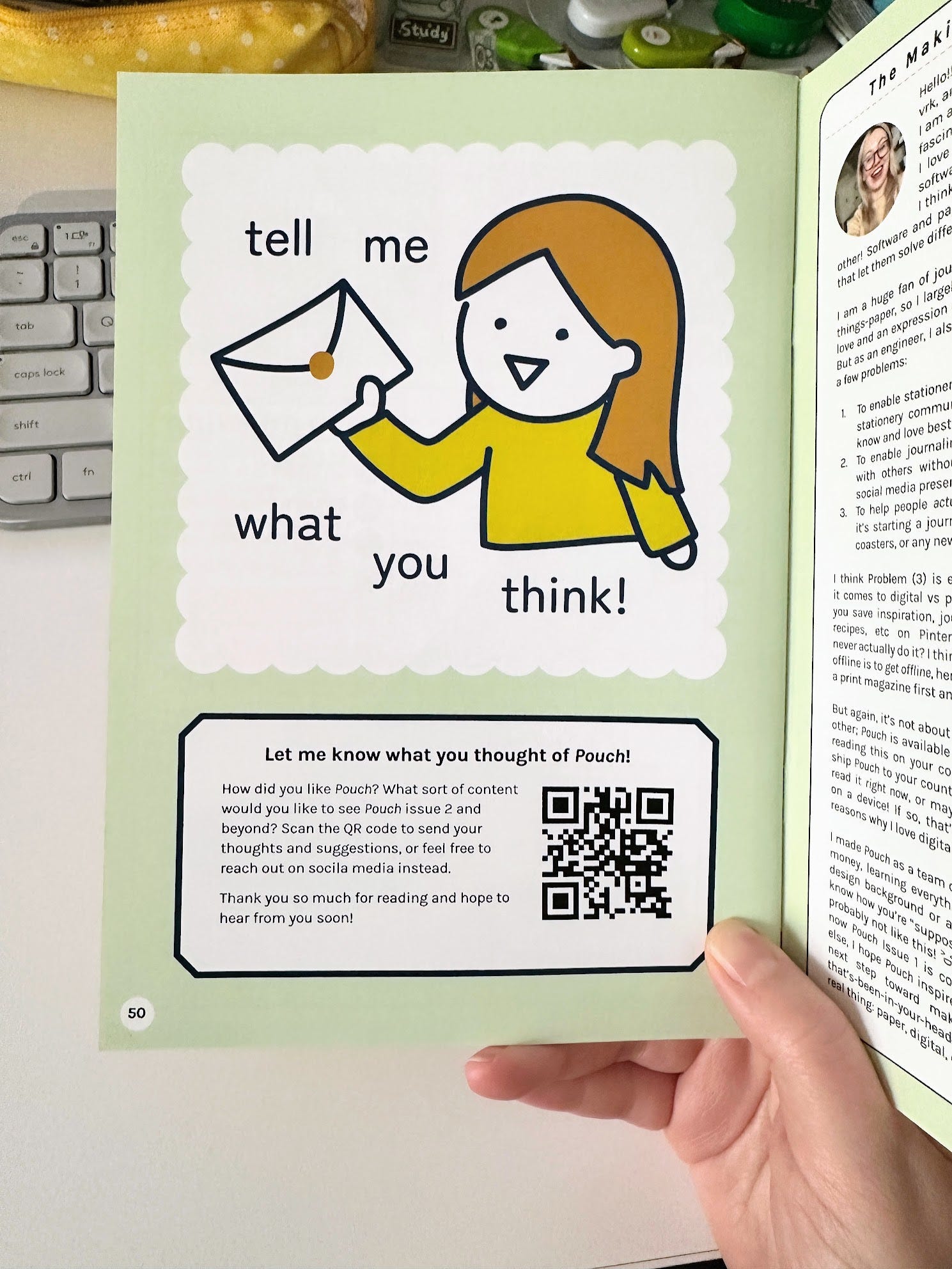
At the very end of Pouch Issue 1, I have a page asking for feedback, with a QR code linking to this survey:
I made Pouch Issue 1 following my intuition, so it has a little bit of everything: Stationery reviews; product recommendations; a DIY; a doodle page; a mix of articles; a journal layout gallery, and more.
But I wasn’t sure that was the right mix of content! I was just kinda guessing, so I really wanted to know what readers thought of it — to the point that I dedicated an entire page of the issue asking for exactly that.
My survey is about 7 questions long, and I find the answers to each question highly valuable — but the results can be roughly summarized by the answer to this single question: Which were your top 3 favorite articles in Pouch Issue 1?


For Issue 1, the majority of survey respondents liked journal layouts, reviews, and inspiration the most, and only a few respondents were most excited by interactive elements like the doodle sheet and DIY.3
Now, it’s important to read these results accurately: It’s not necessarily that people didn’t like the interactive components — it was a few people’s favorites!! — it just wasn’t most people’s favorite part.
The answers to other questions of the survey provided a lot more insight into this trend. Below are snippets of the responses. There were surprisingly few comments against interactivity, and many in favor, including some who even viewed the interactivity as the most identifying feature of Pouch. But most didn’t mention the activities at all.
🛑 Comments against interactivity:
I was not as interested in advice or interactive parts.
I wanted to recommend my local library add it to their zine section but the encouragement to cut things out or mark in it makes me hesitate.
✅ Comments for interactivity:
I liked the playful tone (where you would slip in emoticons lol) and that there was a variety of not only topics but activity pages.
I really see Pouch like a great activity book for adults.
I'd be interested in harder craft things! I thought the coaster and drawing practice were cute but I would be more interested in trying stuff out if it was harder
💛 Unrelated comments:
The journal spreads was my favorite part, very inspiring and each one had a totally different vibe from the other. Really showcased the artistry and possibility.
I'd love to hear more about different ways people use their journals!
🧐 So what to make of this?
When it comes to acting on feedback, I rarely make decisions strictly by the numbers. If I, myself, LOVED the DIYs and interactive-y doodle sections of Issue 1, I wouldn’t have cut them!!
But in reality, omggggggg the DIYs and activity articles were SO HARD FOR ME TO WRITE 😂 Plus they take up a lot of pages and have a bunch of unique challenges (e.g. will a pen write well on glossy pages?).
This made the decision easy! I cut the DIYs and activities from Pouch Issue 2, and focused more on journal layouts, inspiration, and community aspects.
If you have read both Pouch Issue 1 and Issue 2, I would LOVE to hear what you think about this change! Did you miss the DIY & activities? I’m open to adding them back in Issue 3! But did you even notice they were gone? Let me know in the comments or feel free to share in the feedback survey for Pouch Issue 2. (Thanks to all who have already submitted!! 💖)
📋 Plans vs reality
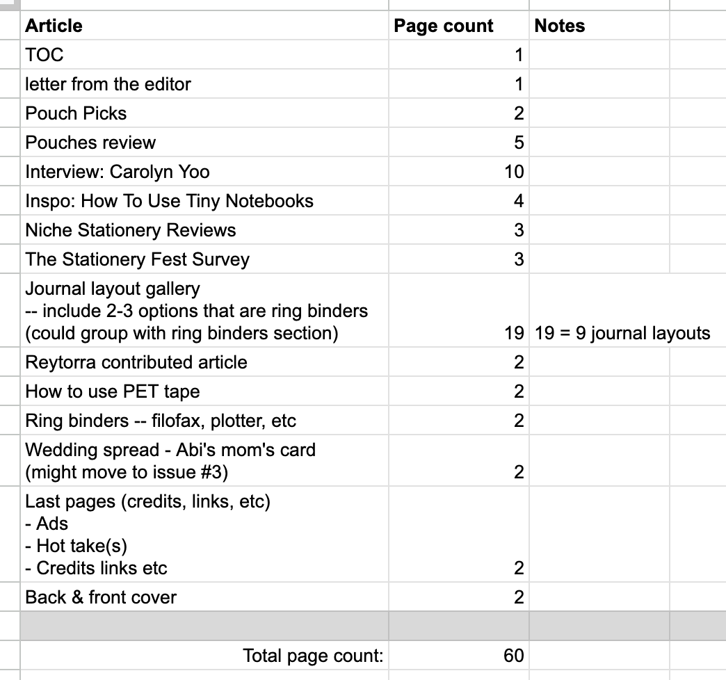
Let’s go back in time for a moment! It’s Fall 2024 and I’m planning Pouch Issue 2. The feedback from Issue 1 has been RECEIVED, and I have a rough idea of what I wanted to do for the next issue: Cut the interactive stuff, replace them with reviews and inspiration, and extend the journal layout gallery juuust a tiny bit. PERFECT! I met up with Nikki and she helped me finalize the outline for the issue.
This is what we came up with:
That was fall of last year — now let’s go back to today!!
If you have Pouch Issue 2, you know the actual table of contents looks like this:
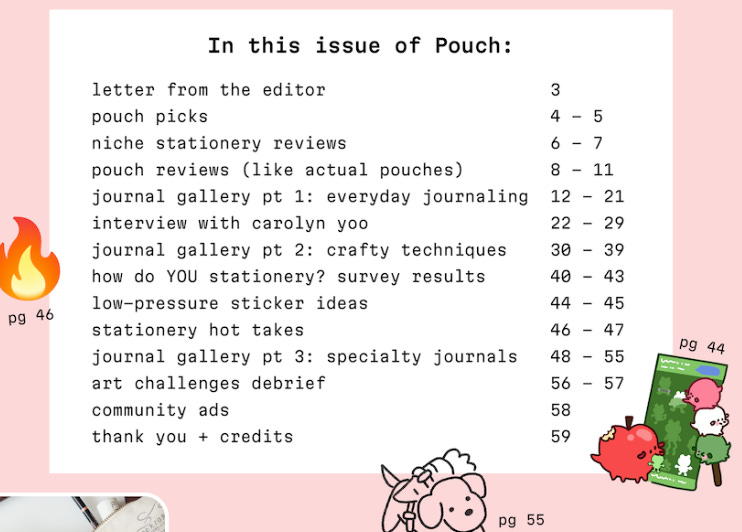
Can you spot the difference? It’s hard to tell at a glance, so I’ll help you out lol.
Notice this line…
We originally planned to include 9 journal layouts in Pouch Issue 2, but in the final issue, there are um… 21 journal layouts. It’s over half the magazine lol. To accommodate this, I cut 4 articles and I shortened 3 others from the original plan.
So…… why the big change?? Let’s get into it!
Side note: The advantage of “mostly one”
Pouch Issue 1 was ENTIRELY a 1-person project. Pouch Issue 2 is MOSTLY a 1-person project, with a few brilliant guest writers, a host of phenomenal contributors, and my friend Nikki as a trusted collaborator, thought partner, proofreader, and sounding board — Nikki is also one of the guest writers btw. (LOVE YOU NIKKI!!)
When I say “Pouch is made by mostly a 1-person team” — I’m not saying this to in any way diminish the work of my WONDERFUL and generous contributors to Pouch — they are the shining stars of the magazine, its very lifeblood and soul!! But I’m trying to give context as to how I was able to make as drastic of a choice as to drop 4 articles from the issue. Like, if I had a team of even two people, I wouldn’t do something so disruptive! It would be an awful thing to do, to unilaterally decide to cut a bunch of other people’s work, for the reasons I’m about to explain! But, as a team of mostly one, I can do this, because the only person it’ll affect is myself. Of the 4 articles I cut, 3 of them were written by me, and the last one was written by Nikki, who already had 2 other articles in the issue, and we might just move her 3rd article to a future issue rather than scrapping it altogether. (And we discussed it beforehand and decided together!)
This is, in my opinion, the greatest advantage to creating a magazine as a mostly one person team: You can make GIANT changes immediately, without affecting anyone but yourself. I think this is especially crucial in the beginning stages of your project, as you’re still figuring out what your vision is. There’s a LOT more to say on this, but for another time!! This is just a side note. Back to the story!!
💌 A blessing and a crisis
So, let’s talk journal layouts!
I had 8 journal layouts featured in Pouch Issue 1. I had opened a call for submissions for over a month and a half, but I only got 2 entries! (JM and Stephanie: YOU ARE MY HEROES FOREVER)
I wanted more than 2 journals in Issue 1, so I DMed a bunch of journallers on Instagram asking if I could include one of their layouts in Pouch. Many people didn’t reply (which, if this was you, IT IS TOTALLY OKAY 🫶🫶🫶 it is so easy to miss a DM, especially from a stranger lol). The 6 people who did reply, became the rest of the Pouch Issue 1 layout gallery. (Marie Techou, Brit, Mia, Daisy, Abbey, bbangi: LEGENDS, ALL OF YOU)
Last fall, I opened the call for submissions for Pouch Issue 2. This was after Yoseka’s Stationery Fest, so more people knew what Pouch was, and I expected to get a few more submissions than the first time — maybe 4 or 5? Oh, in my announcement I had written, “Wish we could guarantee we will print them all, but we're limited on space and page count!!” — but I was not expecting to run into this problem; in fact, Nikki and I brainstormed a list of people we could DM to complete the 9-journal gallery.
But… I got 21 submissions. And they were all brilliant.
Twenty-one is an interesting number. It was more than double what we had planned for, but it’s not 1000 submissions. With 1000 submissions, I simply couldn’t print them all. Or even if I did — imagine I printed a giant book with 1000 journal layouts in it — it’s just a very different thing. As a reader, you don’t have the same relationship with 1000 journals as you do with a curated selection of 10. At a certain point, if you include everything, you’re kinda including none of them. (Well that’s not totally true, but, … I think you know what I mean!)
With this in mind, I could have stuck to the plan and cut over half the submissions: Publish just 9 journal layouts. It would be a tight, curated selection. BUT I DIDN’T WANT TO DO THAT. I’ve said this before but I’ll say it again: It’s an honor to be trusted with a glimpse of someone’s journal. My inbox had 21 heartfelt, beautiful, and carefully made creations, submitted to me by people with the purest intentions, and I loved every one of them equally. How would I choose which ones to include, and which ones to omit?
Now, what I should have done was this: A) Think about this problem way ahead of time, B) Come up with clear guidelines for how I would select the journal layouts, and then C) Publish these guidelines in my call for submissions before anyone submitted anything.
Instead, in my call for submissions, I wrote this:
Submit your journal to Pouch Issue #2
Share one of your favorite journaling layouts or planner spreads with Pouch for Issue #2, and we may include it in the Journal Layout Gallery!
LITERALLY NO GUIDELINES OR SELECTION CRITERIA.
How was I supposed to choose?? How would I explain myself??
Faced with this blessing and a crisis, I wondered: ….Could I just include them all?
I looked at the outline for Pouch Issue 2 and did the page math — I could mostly just cut my own articles and have enough pages for 21 journal layouts. (Btw, 60 pages is the VERY MAX that my printer Mixam will print in this format, so I couldn’t cheat by adding more pages.)
But could I get the design right? Would 21 journals be too much — would it be the equivalent of that imaginary book of 1000 layouts, where, by including everything, I render them all invisible — or was there actually enough space?
I decided: OH WELL WHATEVER, I’M ACCEPTING THEM ALL!!!!!
I replied to everyone saying their submission was accepted, and started laying out the issue.
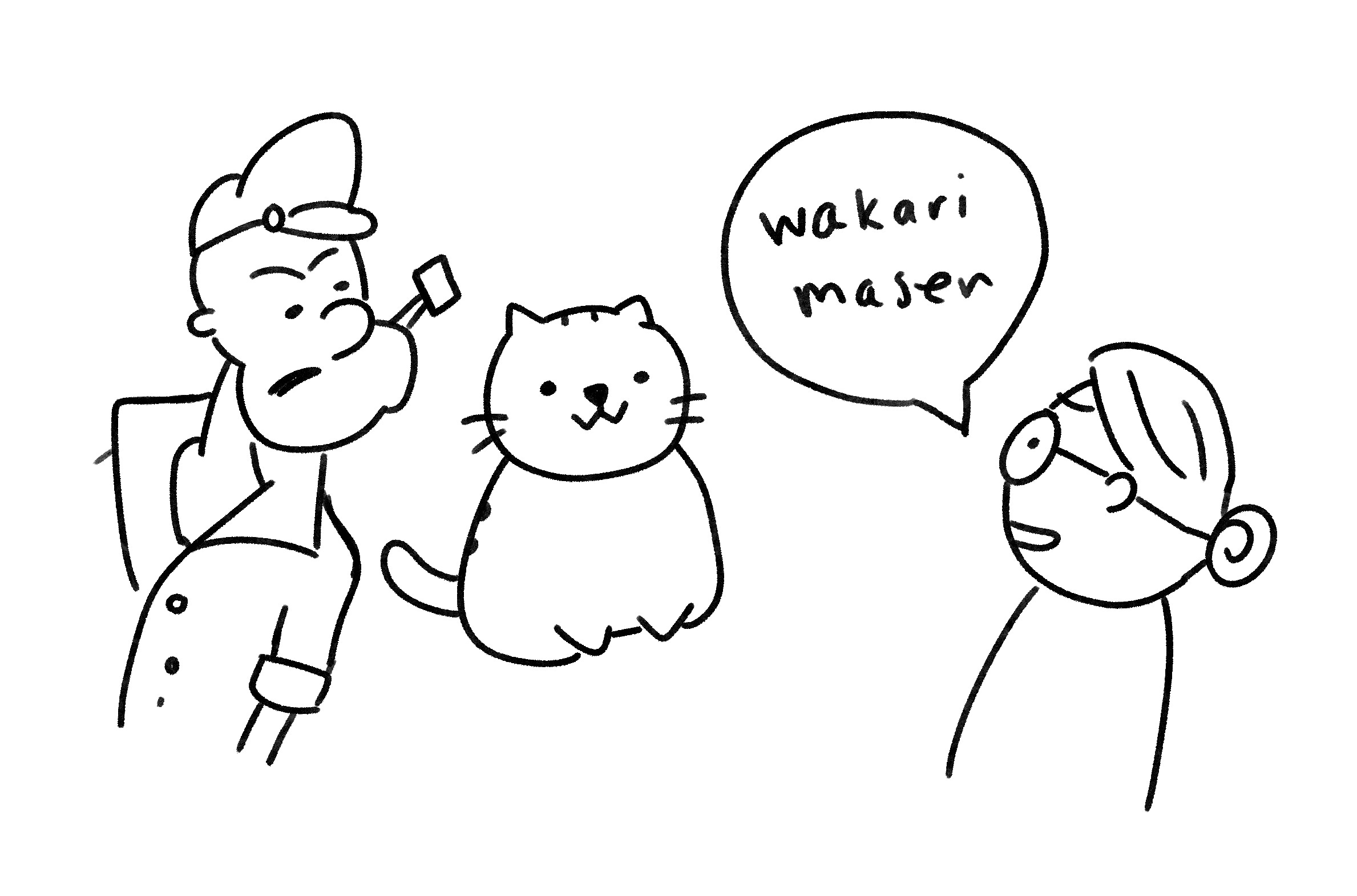
🐈⬛ Help me, Cat-sensei!!
🥬 Save me, Popeye!!
My first plan was just to have one JUMBO-SIZED layout gallery, with roughly the same design on every page.
Here’s a scroll-through of an early draft:
![scrollthru-take1.mp4 [video-to-gif output image]](https://substackcdn.com/image/fetch/$s_!cWAo!,f_auto,q_auto:good,fl_progressive:steep/https%3A%2F%2Fsubstack-post-media.s3.amazonaws.com%2Fpublic%2Fimages%2F01ce0ab1-a622-4d55-8c84-4ef02b5b60d9_800x450.gif "scrollthru-take1.mp4 [video-to-gif output image]")
It’s looking a little visually repetitive, right? The journals are kinda all blending together. Bleh! That’s the last thing I wanted.
Two of my biggest design inspirations for Pouch are these two Japanese magazines: Nyapple (にゃっぷる) and Popeye.
I keep 3 issues of Nyapple and 3 issues of Popeye on my bookshelf right next to my desk, and they’re the first place I turn whenever I have a design problem in Pouch. When I do this, in my head, I imagine I’m asking “Cat-sensei” and “Popeye” (like the sailor man) for help!
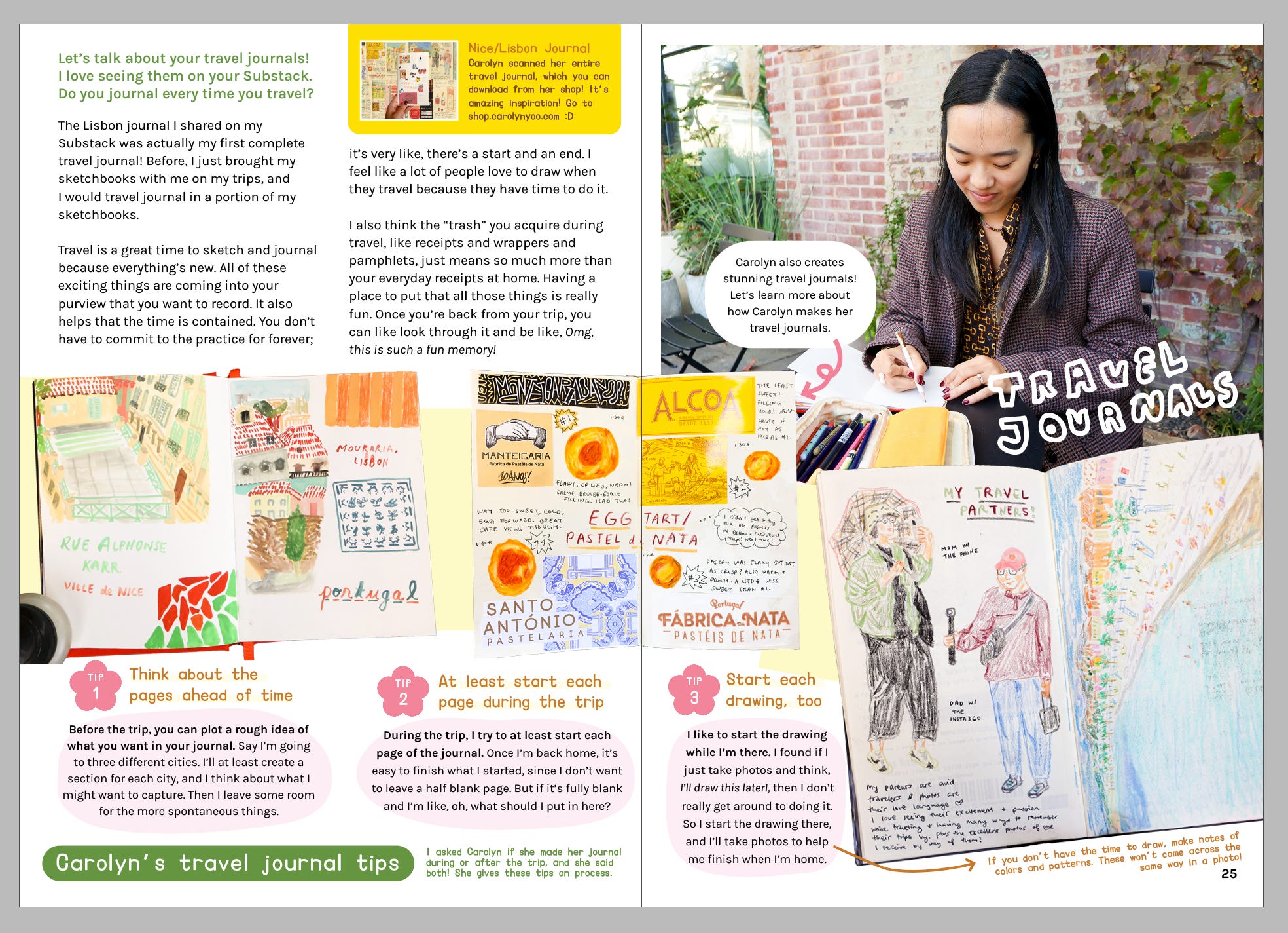
For instance, when designing my interview with Carolyn, I needed to present her 3 tips for travel journaling, but I didn’t want to just use boring old bullet points.
I asked, “Cat-sensei, how would you approach this?”
(I flipped through Nyapple and landed on this layout:)

“Ohh, I see! Thanks, Cat-sensei!”
(If you look at the “1”, “2”, and “3” in the Nyapple article above, you can see I applied a very similar treatment to “1”, “2”, and “3” in the Pouch article below:)
The journal layout gallery was yet another design problem: How do I showcase 21 journal layouts in a single article, with visually engaging designs, while still keeping it cohesive?
This time I asked Popeye: “Popeye, how would you approach the problem?”
Popeye Issue 932 has a MASTERFUL example of this very thing: There’s an article that spans over 40 pages, with a totally different design every 2 pages, with a few repeated unifying elements (the “film perforation” on page edges; the consistent treatment of the page titles) to make it still feel like 1 cohesive article.
Here’s a flip-through of the masterpiece:
“Ohhh I see! Thanks, Popeye!”
I thought, YES this is it — I’m gonna follow this Popeye example and do something similar for the Pouch journal layout gallery!!!
😭 I’M NOT POPEYE
I spent two full weeks re-laying out the entire layout gallery in this fashion. I designed over 30 pages with a completely unique designs every 2 pages, and….
Y’ALL, IT WAS A COMPLETE MESS 💀💀💀
I tried my best, but when I attempted to follow what Popeye seemed to do so effortlessly, my own version looked chaotic and confusing. Flipping through the pages felt disorienting. You looked at a page and you couldn’t tell what you were looking at. It was BAD.
I’m sorry, I don’t have a proper record of what this looked like, because I was so devastated that I kinda destroyed the evidence 😭😭 But I can show you one of my journal entries from the time of the disaster:

In this drawing: I had asked Davis to look over my design files, while I had a minor mental breakdown in the background lol.
I was freaking out because I had already spent 2 weeks on this, and I knew that to make my OTHER deadlines and commitments outside of Pouch, I could not spend 2 MORE weeks fixing my mistakes. But I also did not want to print this version and I wanted — NEEDED — to redo the entire thing.
I talked it through with Davis (who has an art & design background — he made these stickers btw ♡), and we decided I would try this:
See if I could categorize the journal layouts into 3 thematic groups
Choose my 3 strongest designs from THE BIG MESS and make them the visual styles for the 3 categories
Pray that I could do this redesign in 3 days (one day per group)
I went back to work!!!
…But I am what I am 😎

I put every submission in a FigJam board, and I racked my brain to come up with 3 equally-ish-sized categories that fit them all.
(A learning for Pouch Issue 3: PLAN THEMES AHEAD OF TIME AND LIST THEM IN THE CALL FOR SUBMISSIONS!!)
I came up with these:
Everyday life journalling: Journals that record everyday life
Crafty techniques: Ideas for decorating your journal
Specialty journals: Journals created with a special purpose or topic in mind
Then that Monday I designed the first group, Tuesday the second, and Wednesday the third. I finished the magazine by the end of that week, designed the cover the following week, and sent Pouch Issue 2 off to the printers the week after that.
Here's what the 3 sections of the journal layout gallery look like now:
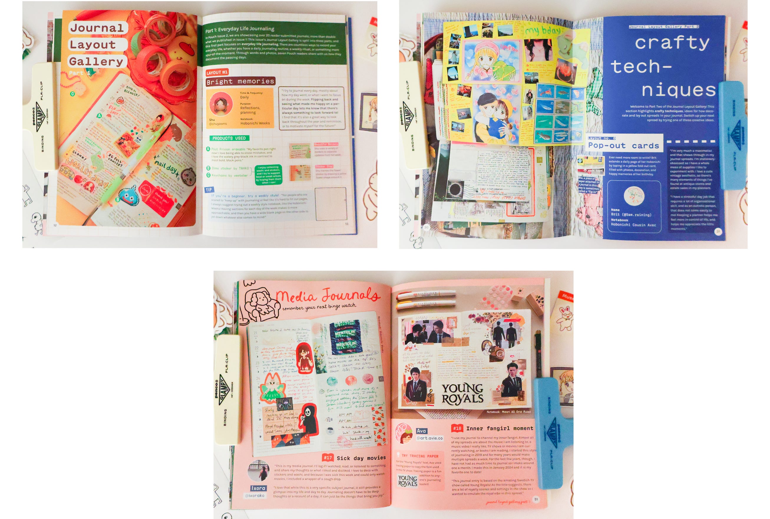
I am ELATED with how it all turned out 🩵
No, I’m not Popeye or Cat-sensei, and the pages of my idols’ respective magazines continue to amaze me. Oh how I wish my senseis could talk back to me; I desperately want to ask, Popeye, how the HECK did you pull this off?!4 But despite my utter failure in trying to replicate the elegance of Popeye Issue 932, I’m satisfied. I put my heart and soul into the design of the issue, and I couldn’t be more proud of the result.
❤️🔥 Pouch Issue 3 and beyond
I flip through the pages of Pouch #2, and the issue feels so good! It was an accident that over half the issue is journal layouts, but a happy accident. With so much content from the community, the issue feels ✨alive✨.
From an experimentation standpoint, I also love that Pouch Issue 2 has WAY more journal layouts than Issue 1, and I greatly prefer this to the original plan of making relatively small adjustments from Issue 1 → 2. I expect I’ll learn a lot more from the feedback this way, since it’s such a significant change.
When I posted the launch announcement a few weeks ago, many of you were seeing the issue for the very first time. I read your kind supportive comments and excited reactions, and I sat on the couch and cried, overwhelmed with emotion. I am so so proud of this issue and I love it with all my heart!!!!
Yet — I want to make this clear!!!! — I still don’t know if Pouch Issue 2 has the “right” mix of content. Is 21 journal layouts too many? Honestly, it MIGHT be! I REALLY want to hear from you, Pouch readers!!!
I love Pouch Issue 2, but that doesn’t mean I don’t want your candid feedback! I promise you, there’s no chance your feedback will make me love the issue any less 💖 AND, conversely, your feedback will be extremely helpful to me as I plan Pouch Issue 3. At some point I’m going to sit down and brainstorm the third issue, and when I do so… what would you insist that I keep? What should I consider changing or adding? If you read Pouch Issue 2, please fill out the survey and let me know!
When I think about the next issue of Pouch, I wonder: How many submissions will I get? More than 21? Less than 21? Will I be able to include everyone’s submission again? I don’t know. But this is why Issue 2 feels like a treasure: Who knows what the future will hold, but I know in this issue I was able to include everyone who went out of their way to offer us a glimpse into their private world. It feels remarkably special.
PS: Don’t forget: Pick up a copy of Pouch Issue 2 and come hang with us at the launch party!! See you there!!
See Side note: The advantage of “mostly one” later in the newsletter
Though I DO have a lot of writing experience, I’m working on my graphic design skills, and — most important of all — I have a PASSION FOR STATIONERY ❤️🔥 which is how it’s still possible for me to make Pouch despite my horrible lack of qualifications for the task 😂 Aaaand well what’s truly most important of all: I’m still on sabbatical lol, meaning I’ve got lots of time, and I am choosing to spend a significant portion of that time on Pouch!!!
Ow my hand was a “stationery problem-solving” article lol, which I’ll gloss over since it’s kind of an outlier in these results 😆
OK I know that Popeye magazine is not created by Popeye the Sailor Man, and Nyapple isn’t made by a mythical all-knowing Design Cat, and so there should be a way for me to learn how the real-life humans behind Popeye and Nyapple do their magic. BUT I HAVE NO IDEA HOW TO FIGURE THIS OUT, as a non-Japanese speaker living in the US!! Just putting it out there: If anyone could help me learn more, I WOULD BE ETERNALLY GRATEFUL!!
Don't beat yourself up too much for not being exactly like your fav magazines, they get a whole lot more room to play with ! But the inspiration is incredible because I love how detailed the spreads are. congrats on the new issue <3
Will always feel so special that I got to be in issue 1 (always happy to help!!!) — but wow is it cool to see all the variety and fun in issue 2. I’m so glad you worked through the breakdown era to make those journal entries pop!!!
And as always, I love reading the process behind it. I never would’ve known you didn’t already have the thematic groupings in mind when you made the layout! They feel really natural.
And sooooo clever to use references for the layouts — we used this technique with old issues of Antiques when I worked there; sometimes our designer would lift them and give them a twist from issues 20,30,or 80 years prior!