
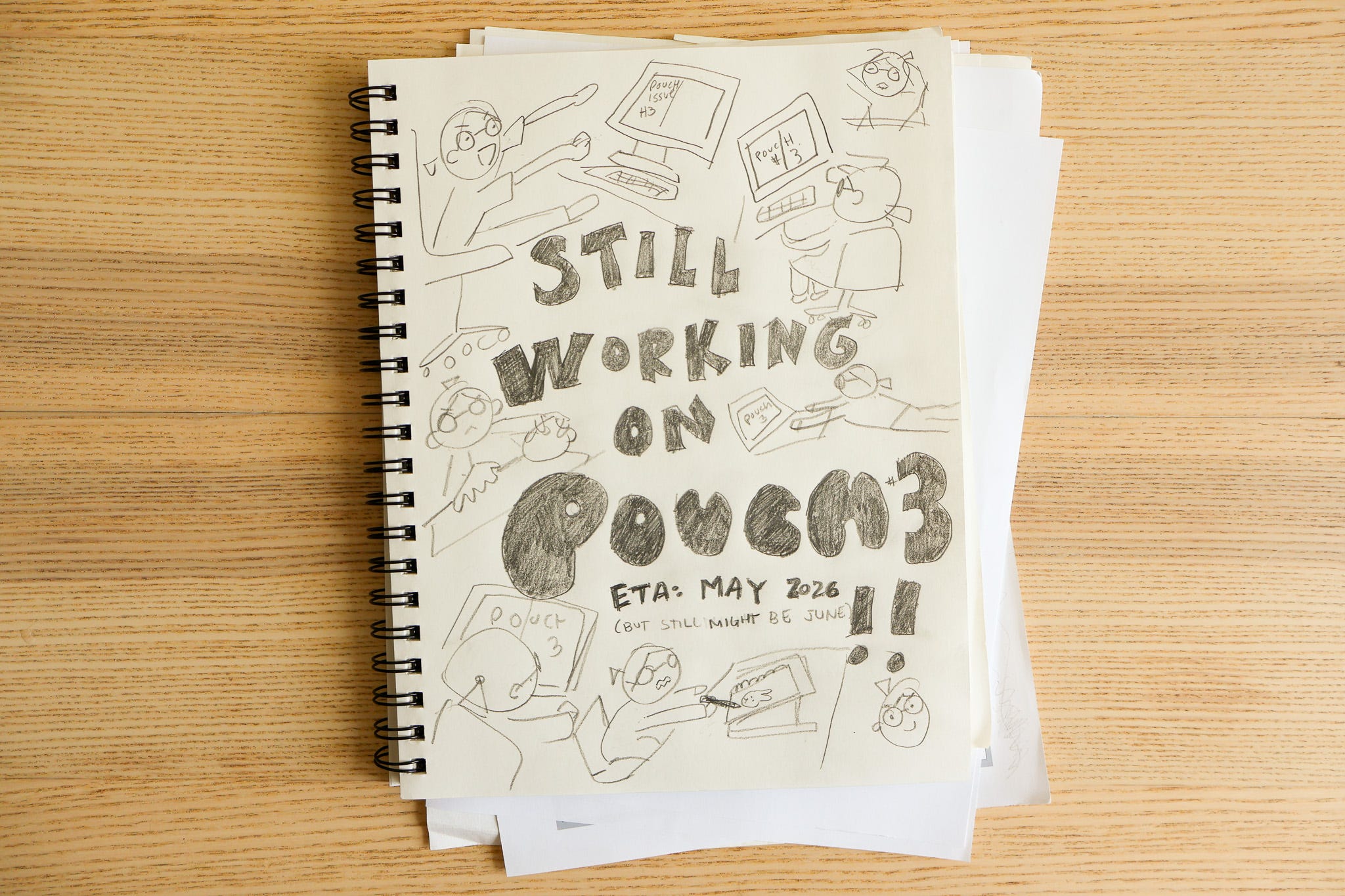
Pouch 3 progress updates!!
ALSO and perhaps most importantly, I finally learned how draw an angry dinosaur 🦖

HELLO friends!!
I’m coming to you from the depths of Pouch 3 production, and I wanted to pop up for air to give some quick updates.
First: Pouch 3 is coming along beautifully!! Just about all of the content is written, reviewed, and ready, and I’m in the middle of designing and laying out the pages. The design work is the most exciting and fun part for me, but it’s also by far the time-consuming, labor-intensive, and challenging, too.1 It’s also work that I still do all by myself, so it’s intense!
I’ve got over half the magazine done at about 50-90% polish level, and I’m feeling really proud of how it’s turning out!! 🥹 Pouch Team members Carolyn, Nikki, and Tami have all written beautiful stories, the Issue 3 submissions are unbelievably inspiring, the interview we have to share is SUCH a joy, and JM my editor has been my rock the entire way 😭
OH and I have to tell you more about this another time, but: I have been getting 1:1 mentorship on the cover from my friend, legendary illustrator Aaron Fernandez!! I’m a very blessed nepobaby to be getting feedback from someone so absurdly overqualified lolll. Thanks to Aaron’s guidance, I feel like the cover I’ve drawn is, FOR ME, the equivalent of the Sistine Chapel LOLL. I am feeling amazing about the issue and I truly cannot wait to get it to print!!
The next natural question: When will Pouch 3 be ready?
On the preorder form, I said that Pouch 3 was “coming sometime between April - June 2026.” Now that we’re a few days from entering that timeframe, I estimate Pouch 3 will PROBABLY be ready to ship in May. (It’s absolutely not happening in April lol.)
I was trying really hard to get Pouch 3 ready by April, but some personal stuff came up in addition to the usual scheduling mishaps, so things slipped and right now I’ve still got at least 3 more weeks of “making the magazine” work to do. If the issue is ready-to-print by mid-April, that means Pouch 3 would arrive ready-to-ship from my apartment in early May. It’s still just an estimate though, not a guarantee.
I’m clearing my calendar for the foreseeable future to finish this up!! Apologies in advance for all the emails and the coffees I’m gonna delay until the issue is done lol 😭
Finally: If you submitted to Pouch, I have NOT gotten back to anyone re: submissions yet! I’m so sorry for the wait! I wanted to get back to people by end of March, but delays in production cascade and I had to push this back, too 🥲 You’ll hear back on whether or not your submission is making the issue about 2 weeks before I print it, so: probably in April sometime. More on that below 💓
In today’s newsletter, I’m gonna go through more Pouch production scheduling details, then I’ll also share something that has felt important to me: My illustration & design class!
Thanks for reading and stay tuned for Pouch 3! Please wish me luck as I finalize the designs, and if you really want to go the extra mile: Please specifically pray to the color gods such that I may find expressive, visually pleasing colors that also print properly. Thank you 🙏
♡ vrk
🧐 Pouch 3 in-depth status, March 30 2026
Magazine:
All writing is done and almost everything is fully revised and copyedited too.
Photography is mostly done with remaining “photoshoots” scheduled. (These “photoshoots” are very lowkey lol)
I’ve designed over half the issue at around 50-90% polish.
The cover illustration is done. Need to refine, reline and color.
Tentative schedule:
The next 3 weeks: (March 30 - April 20): Finish all layouts to 100% completion. Finish the cover. (Might need 4 weeks for this but reaaaally trying to timebox.)
Week of April 20ish: SEND OFF A TEST PRINT!! Finish end pages & letter from the editor. Contact contributors re: submissions.
Week of April 27ish: Color corrections from the test print. Contact preorders asking for mailing address confirmation. Prep for Pouch 3 launch.
Week of May 4ish: MAKE THE BIG PRINT ORDER
Mid-to-late Mayish: Official launch & begin fulfilling preorders!
💌 Submissions: You’ll back in mid/late April
(…oooor later if I’m stuck on designs)
The Pouch Team has reviewed each and every submission, and they are sooooooo good!!!!! 😭😭😭 Thank you to everyone who submitted. The Pouch Team is so lucky to have the privilege to see and be inspired by all of them, and I am going to print AS MANY as the issue can handle.2
I haven’t gotten back to anyone regarding their submission yet. I wanted to get back to folks by end of March (that’s what I said on the submission form!), but that timing was dependent on me finishing the designs as planned. My design timeline has slipped 😭 so that means I need to delay informing folks about their submissions, too. My new ETA for informing folks re: submission results is “end of April 2026.”
You might be wondering why I feel the need to finish the designs before telling folks yes/no on their submission. This has to do with how we approach submissions:
When reviewing submissions, Pouch is not trying to assess what are “the best” layouts we’ve received; we don’t believe in that premise. A glimpse into a person’s journal is a glimpse into their inner world — how could such a thing be ranked? Every single submission we get is beautiful, moving, and absolutely worthy of inclusion in Pouch.
Truly any of the layouts could make it into the final issue! The final selection is determined by these factors:
Layouts we believe present new ideas to Pouch readers
Layouts that editorially complement the other articles in Pouch 3
Layouts that “flow” best with the design of the magazine
Until the designs are finalized, I am not 100% sure what will be printed. I would hate to tell someone that their submission has made issue, then later say “oops sorry we actually had to cut it!” 😭 So, you’ll hear back on submissions when I’m done with the design of the magazine, which I now estimate will be mid-to-late April. However, if I’m late on the design, submission results will be delayed too 😭😭😭
I’m so sorry for the long wait times!! I’ll try to improve the process in the future, though tbh I don’t think it’ll be feasible unless/until I can hire another designer besides myself, OR unless/until I get way better & faster at design such that my process is less chaotic and more predictable lollll. (See below, I’ve been taking a class!!) I’ll definitely be clearer on expectations re: timelines next time around. As a reference point, it took me about 6 months to get back to folks re: Pouch 2 submissions 🫠, which was absolutely not intentional lol. I DO NOT think it will come to that, but let’s cross our fingers regardless 🤞
To everyone who has submitted a layout: MY BIGGEST MOST HEARTFELT THANK YOU!!! I will be letting everyone know the status of their submission as soon as I possibly can 🙏
Please don’t hesitate to reach out anytime if you have questions at victoriakirst@gmail.com. (I will prioritize these emails even if others might go on the backburner for a minute ^^;;)
🌟 I’ve been taking an illustration & design class
At the beginning of this year, I made a daring choice: I signed up for a 10-week illustration & design class that directly coincided with the most labor-intensive parts of making Pouch 3.
So much of Pouch is illustration and design! I thought if I took this class at the same time as Pouch 3 production, I’d be able to immediately apply what I learned, which would benefit my learning and improve the issue too.
The risk, though, was obvious. Designing and illustrating an issue of Pouch is a MASSIVE amount of work, and the class sounded like a lot of work, too! Doing both at the same time might be too much.
Well, I just finished week 7 of the course aaaand… iiiit’s… been a lot to juggle LOL. The illustration course isn’t a “studio” where you complete the work during the 3-hour class time; all the work happens as homework, and class time is critique time. Sometimes the homework is a set of 4 spot illustrations; other times it’s a book cover, etc. But no matter the assignment, it has to go from concept to completed work in a week.
Every week I tell myself, OK, I’m super busy, let me do what I can in an afternoon and call it good. Yet as soon as I start, I spend a lot more time on it!
I’ve known since I was literate that writing was important to me. There are few triumphs I respect more than a well-crafted sentence. I feel deeply proud whenever I write something that I believe expresses what I am trying to say. Someone asked me recently whether writing was a “hobby” to me, and my gut reaction to that question (that in no way offended me) made me realize that I view writing as fundamental to my being. Hobby? No, writing is a natural phenomenon that occurs on some regular basis whenever I’m functioning properly as a human. I’m not a professional writer, but how is that relevant? A volcano isn’t a professional volcano. This also has nothing to do with whether my writing is “good” (do I think my breathing is good?). When I’m writing I’m healthy and when I’m not I’m not. Does that make sense? See, I wish I was better at writing! (I do not feel deeply proud of this paragraph.)
I’m starting to suspect that drawing holds similar importance to me. I’ve always revered drawing, though it existed on a different plane from writing. Perhaps that’s why I didn’t draw more. Whereas writing was essential to the function of mortals, drawing was the domain of gods. Eiichiro Oda = GOD. Akira Toriyama = GOD’S GOD. I drew occasionally, but only in deference to glory, i.e. fanart of manga I liked lol. (Is this my own Sistine Chapel again? What is The Creation of Adam but a sublime Bible fanart? God’s God’s Gods drawing Gods – GODS, ALL THE WAY UP! You can see why I felt drawing wasn’t meant for my unanointed hands.)
This class has forced me, week after week, to draw what’s in my head regardless of whether I deem my ability or imagination worthy of external expression. In doing this, it’s not that I’m feeling called to be an artist; that’s not the feeling at all. Nor do I think my illustrations are remarkable. It’s really the opposite. I am realizing that drawing, to me, feels fundamental in an unremarkable way, in a way I suspect might be universal.
If writing feels like breathing, drawing feels like… talking? Like, oh, my whole life I thought “talking” was limited to making sounds come out of your mouth, but now I’ve discovered this whole OTHER mode of communication that’s just LIKE talking, but visual. Now that I know this, I see that I’ve lived very quietly, and I don’t have to be so quiet, and, I think I have things to say. I think I’d like to learn how to speak.
There is almost nothing more creatively important to me than finishing Pouch 3 right now. However, learning to speak is one of them. So my illustration class is taking up nontrivial space in my schedule, and Pouch 3 probably taking a little longer because of that. (Though who knows, time behaves strangely! I suspect schedule mishaps would have happened regardless.)
At any rate, I wanted to share with you some assignments from my class. Please view them gently, I am but a student!
✏️ Illustration & Design Homework
All of these assignments are from Melanie Marder Parks’s Illustration as Design as Illustration continuing ed course, which I could not more highly recommend! She’s going to offer the class online after this term, so you can sign up this summer even if you’re outside of the NYC area 💖 I’ll share a link when it’s available!
Homework 2: The Word And Image Are One
An excerpt from the assignment description:
Choose a word from the list I have provided below (or use a word of your own).
Find a way of designing and illustrating the word so that it conveys the feeling of what the word means.
The word’s meaning should be clear immediately
…
Try NOT to think of the LETTERS as simply LETTERS but rather as ILLUSTRATIONS or DESIGNS that convey the meaning of the word.
After the assignment was announced, I had a concept: I wanted to write the word “emergency” where every letter feels like it’s panicking in its own unique way.
But oh man this was much harder than I thought!! Too chaotic and it was unreadable. Too readable and it lowers its volume. And how do you make a letter look panicked?
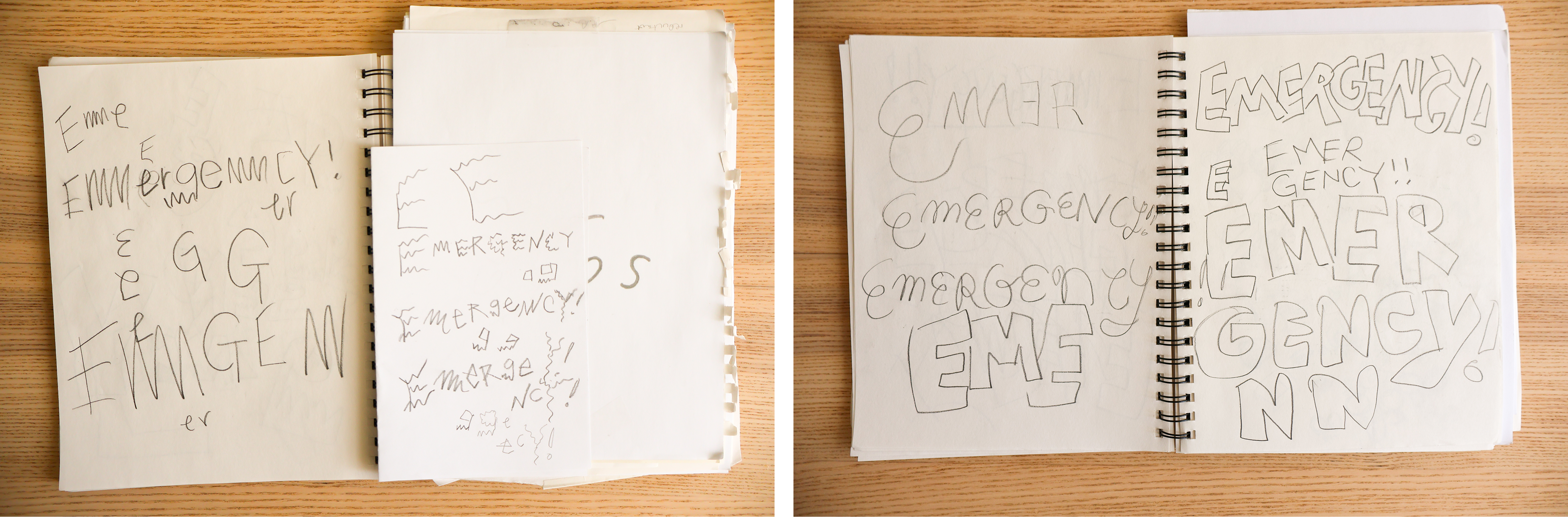
Here’s what I ended up with:
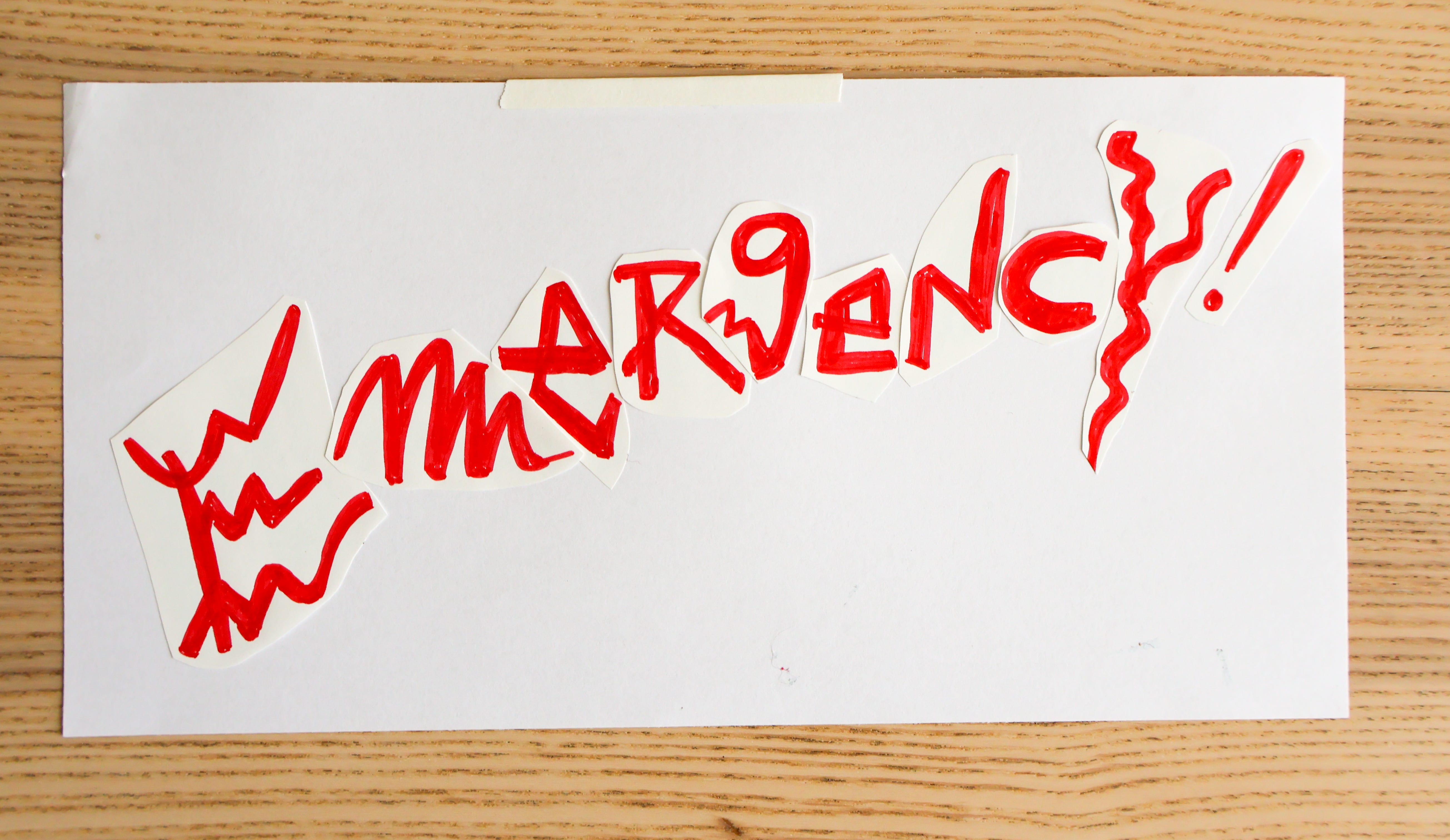
During critiques, Melanie gave me great feedback on medium (this is a better fit for brush vs marker) and legibility (vary the size, spacing, placement a bit more). The class thought the chaos was well-communicated, though.
I’m particularly proud of the “m,” which I drew wrong on purpose. It was polarizing! Some hated it, others said it was their favorite part. (Did you know that the way you write an “m” could repel or draw someone in?)
I never cared for typography. All those silly rules, and so pretentious! Typography seems to demand assimilation to its silly worldview, then wields its institution to classify others as “pedestrian” and its devotees as “cultured.” Yes, I too could buy an $800+ font and put it on a grid. Yes, I too could tame my text into neat, obedient columns and then slather whitespace all around them. BUT IT’S BORING. Narrow-minded, even! I SCOFF AT YOU, TYPOGRAPHY!!!
However, I think my disrespect for typography made me overlook letters as something that is interesting. Such a mistake! There are so many ways to draw an “e” and they all feel different. Then you put the “e” next to an “m” and now it’s a dance. I shall be paying more attention to letters.
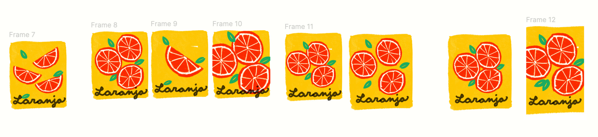
Homework 4: Upscale Drink Label
Using the Italian fruit wrappers as inspiration create a beautifully designed label for an upscale (fancy) Lemon or Orange drink (or choose your own flavor). This will be a non-alcoholic, organic drink (an alternative to wine) and will be bottled in WINE SIZE bottles. Make it sophisticated and appealing.
Keep in mind that this should STAND OUT on a shelf in a shop or restaurant or in a store window.
You want it to look as enticing or striking or beautiful, clever or even funny, as possible. If it’s something people want to look at they will buy it (sometimes).
…
Include the name of the drink, perhaps an attractive image… NOT TOO COMPLICATED.
Think BOLD, BRIGHT and CLEAR.
I was stumped. HASN’T EVERY DRINK LABEL BEEN DONE ALREADY? How could I possibly create something new?
Rather than making a fruit-centric design, I though I’d do something cute with a character. I’d seen pictures of squirrels eating oranges. OK I’ll make a squirrel eating an orange…
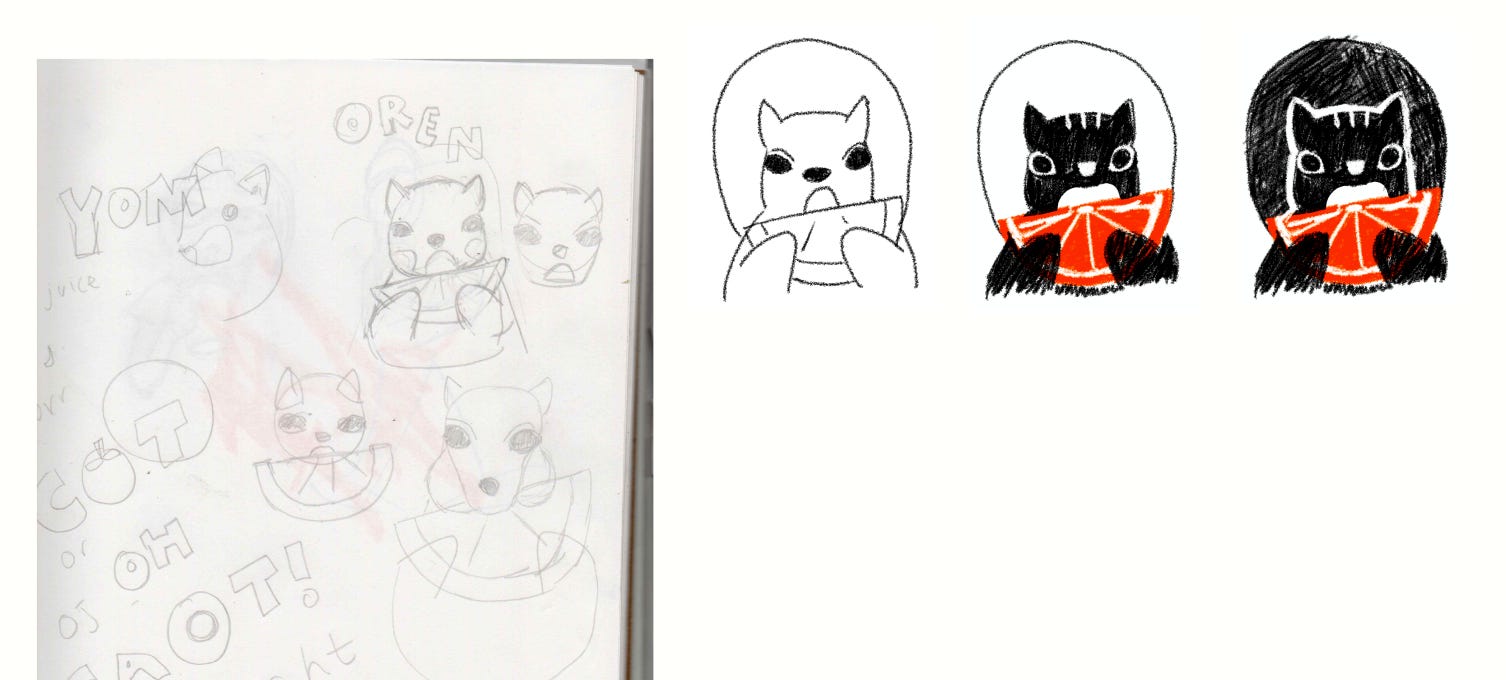
Gahhh but I didn’t like where it was going! I thought my squirrel wasn’t reading as a “squirrel” and the assignment due date was looming near.
Was I overthinking it? I played around with the orange slice. The orange cross-sections looked like a flower bouquet.
I was working in Procreate, but after the last homework, Melanie emailed me to encourage me to try painting. I was skeptical to say the least! Not of “painting” — I believed my work would look better painted, but only if I knew what I was doing, which I did not. Besides finger painting in kindergarten, the only painting I had done was paint-by-numbers, AND they did not look very good lol. I figured, Okay let me make a token attempt so that I can show Melanie how bad I am at painting.
The painting is on the left; the Procreate print is on the right:
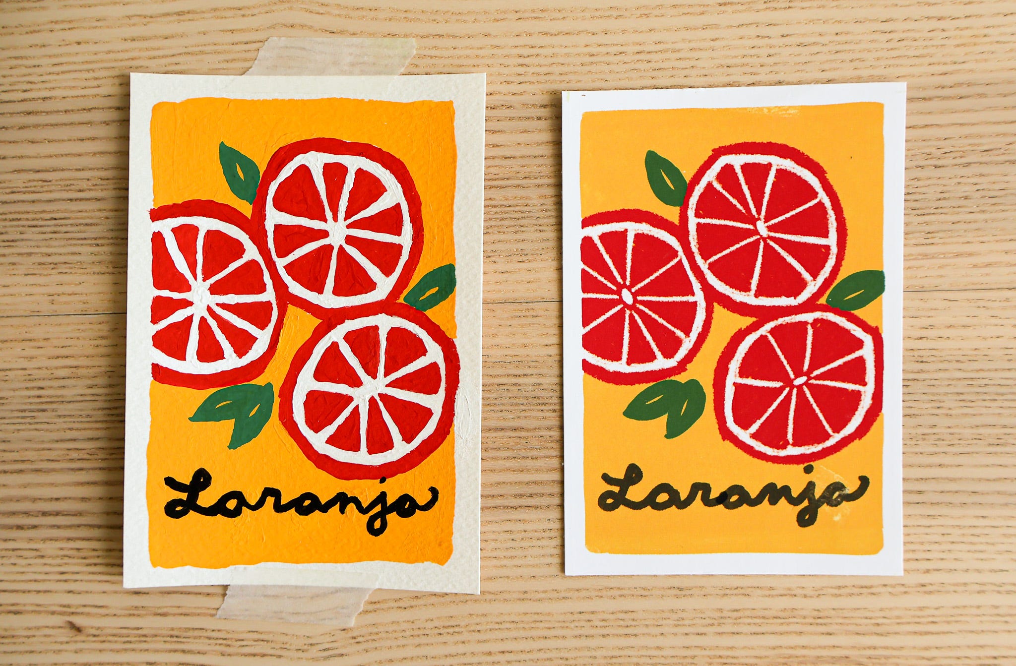
…Yeah. The painting is a LOT stronger 😭 (It’s even more obvious in person!)
I was genuinely shocked! Granted, I am not great at using Procreate, but I’ve got far less experience with physical paint. The texture, the color, the everything was better painted. Using an actual brush also felt infinitely better than scratching my iPad with a stylus. As a well-documented print enthusiast, I find myself once again humbled by the power of analog mediums.
Melanie said of my design, “You could see this from outer space.” I was really proud of that comment!
Homework 5: Poetry Book Cover
Your job this week is to design and illustrate the cover for a book of poems.
For subject matter you have MANY choices: A book of poems by one of your FAVORITE poets or use one of my titles: Old Possum’s Book of Practical Cats by T.S. Eliot, Selected Poems by Oscar Wilde
A general anthology such as: A Book of Favorite Children’s Poems, My Favorite Poems, Love Poems, Poems for the Evening, Jazz Poems, Travel Poems, Nature Poems, etc.
Or you can make up a title.
If you decide to do a “general collection” of poems for your cover why not include a line that says, “Selected by … (and use your name or make one up).” You are in charge!
The cover may be purely decorative, reflecting the atmosphere or the contents of the book. Or it may be purely typographical. You could have an image (a landscape, a person---such as the poet or someone in one of the poems, or an interior scene) or a group of images (but not too many).
A line from one of the poems might inspire a cover illustration or think of an image that is representative of the poetry in the book.
This assignment stumped me, too! I never buy poetry books. I wasn’t 100% sure bookstores had a section for them — they MUST, right? Sure enough, I went to McNally Jackson and found the poetry corner.
Bleh… I hated the covers lol.
I was so not feeling this assignment until Melanie emailed us a few of her favorite poems: Wild geese, Aedh Wishes for the Cloths of Heaven and The Orange.
I read these and remembered, ohhhh that’s right, I do like poetry!
Poetry is jarring. You read one and it’s like WHOA where am I? I get so mired in life’s tasks sometimes, then a poem comes out of nowhere and is like, bam, PORTAL TO ALTERNATE UNIVERSE. When I think about poetry abstractly, I forget this. I ought to read more poetry.
Reenergized, I wanted to try two things with this illustration:
Make a cover for a poetry book that I would pick up
Communicate that feeling I described, to remind me what reading a poem feels like
My concept was this: You’re going about your day in the city and suddenly you see a deer. The deer is feels so out of place and otherworldly, but it’s also very much part of this world. This encounter makes you remember that life is bigger than your to-do list.
I sketched a few versions of girl-encounters-deer, and I made the deer BIG because Aaron has been encouraging me to play with scale more lol. Then I triedddd to color it but ughghh could not get it right!
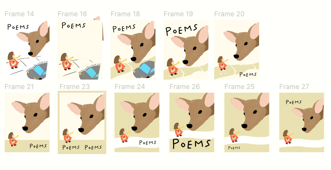
I needed to just finish, so I went with a single color:
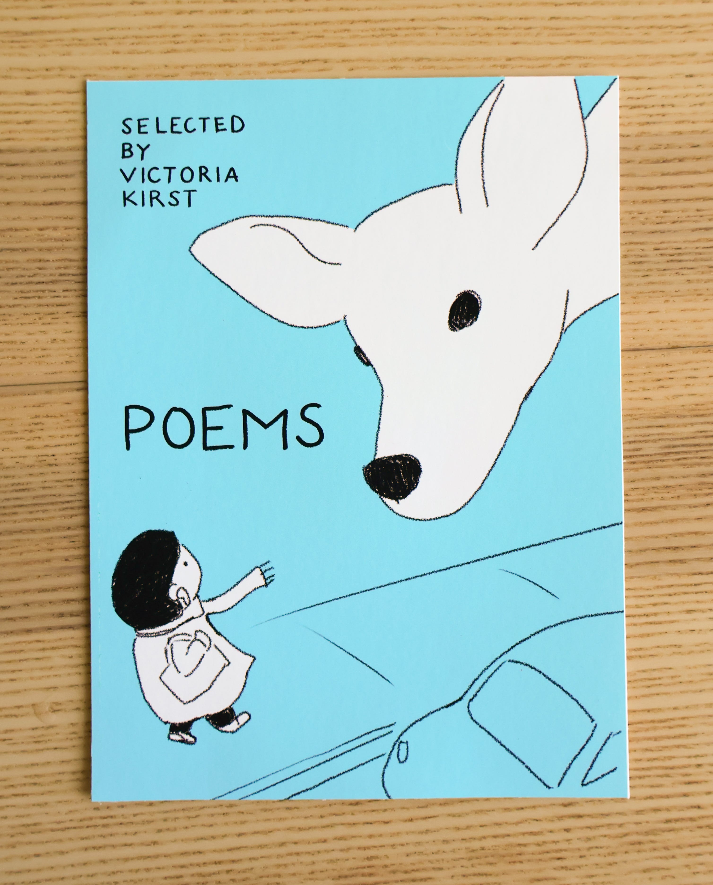
Melanie: “A really lovely mood. The letters are well-spaced. The illustration style is a little childlike, but that’s not a bad thing.”
I agree the childishness isn’t bad per se, but it’s alsoooo not intentional lol. My drawings just look like that and I want to have more control over it! It’s something I’ll work on.
Homework 6: Emotions
Our objective in this assignment is to illustrate 4 different moods, expressions, feelings, emotions, or states of mind in our work.
…
You can use human faces or dogs or cats as your subjects, or any animal, or a variety of animals, or flowers, fruit, vegetables, clouds, hearts, or any shape … the subject is your choice. Choose something you like to draw.
Have the COLOR and the STYLE of your drawing bring out the emotion and feeling you are trying to convey.
FINALLY an assignment that felt intuitive! As an enjoyer of comics and stickers, I didn’t have to go on a spiritual journey to find my approach.
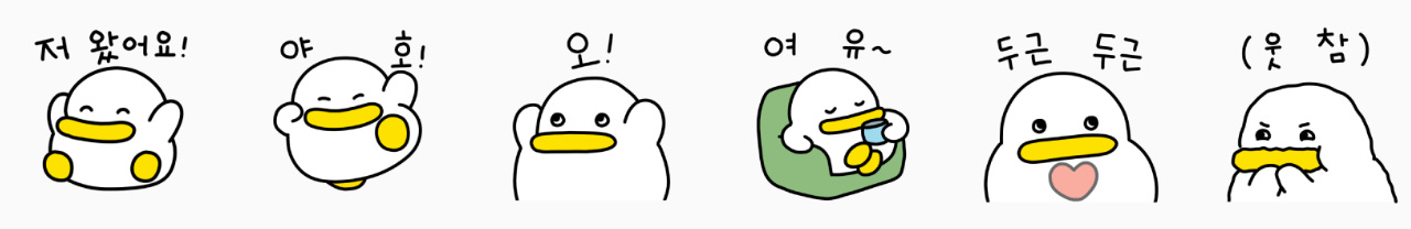
My first thought was KakaoTalk sticker packs, like these ducks:
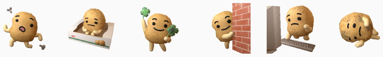
Or these potatoes:
I needed to decide what thing to draw. I knew I could draw bunnies, since I’ve drawn a lot of expressive bunnies for Pouch, but I wanted to try something new.
On a walk, I passed by a street with neatly arranged trash cans:
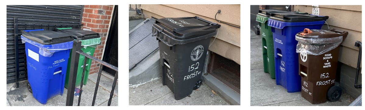
I was like, ummmm kawaii????? They look a little like whales 🐋… or Muppets??
I started designing a trash can character. My first attempts were Muppet-y, but Muppets can get scary-looking quickly lol, so I simplified.
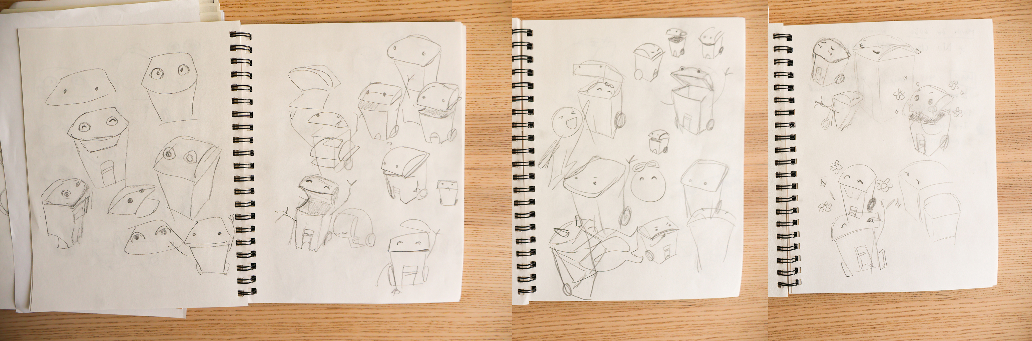
I chose a set of 9 and tried two finishes: One lined & colored in Procreate; the other lined in Procreate and colored with color pencil.
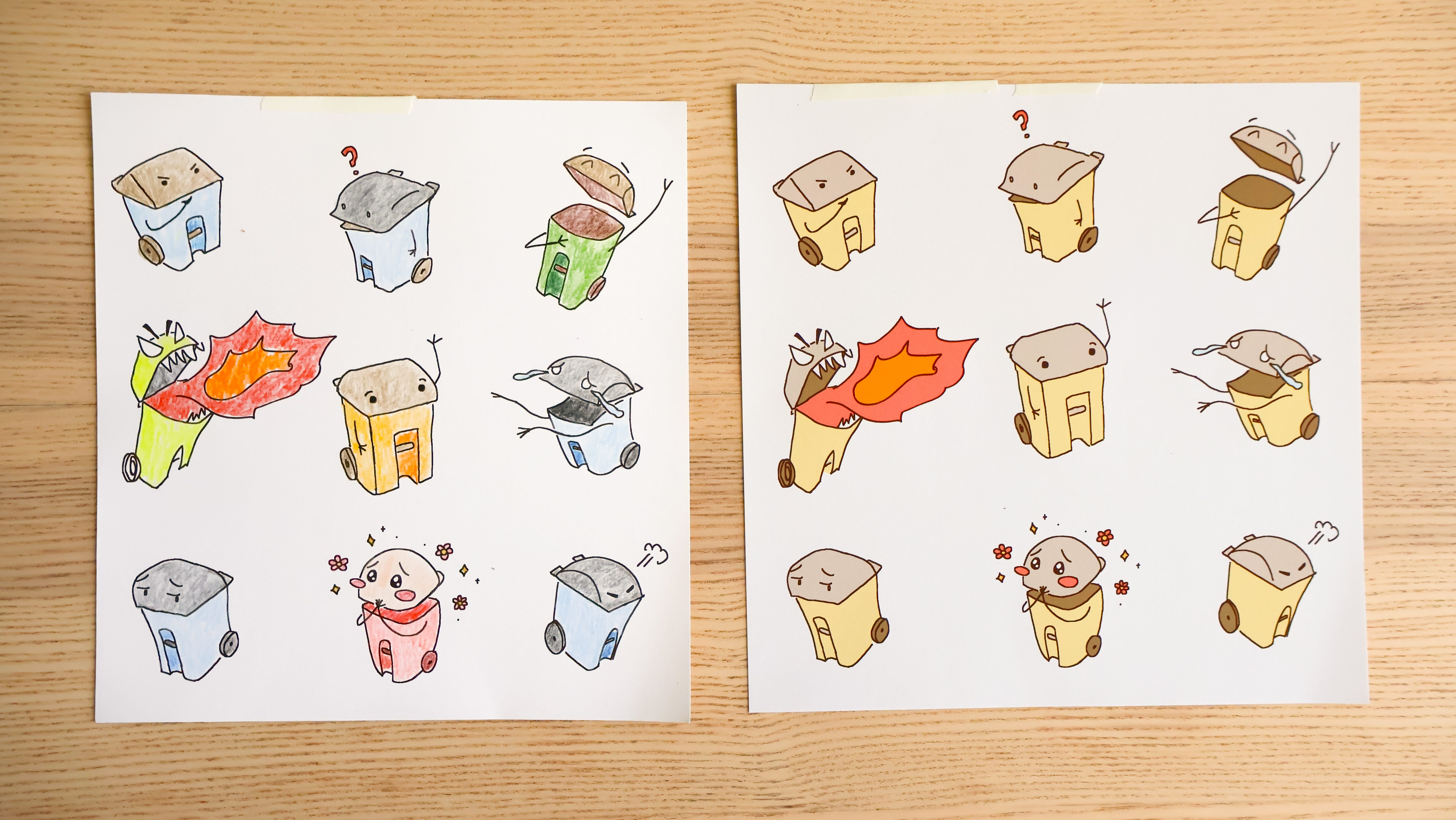
I’m really happy with the drawings. I like how I played with the shape of the character to match the expression, like the trash can in the upper-left corner is more angular; the pink one is rounded, etc.
But I’m dissatisfied with how I colored both lol. The digital coloring is clearer but flatter, and the analog coloring has more texture and interest but kind of directionless and muddy. I think the analog version is more compelling (again!!) — but I need more practice with pencils.
Omg my classmates had SUCH good suggestions!
One person said he imagined the blushing one was looking at her crush, the garbage truck, pass by LOLLL 😭
Melanie said that these are called “Wheelie Bins” in the UK, and another classmate suggested I name them “Wheelie”!! SO CUTEE!!!
After more revisions, I want to make this into a sticker sheet! (After Pouch 3 lol.) Keep an eye out for them at Stationery Fest 😂
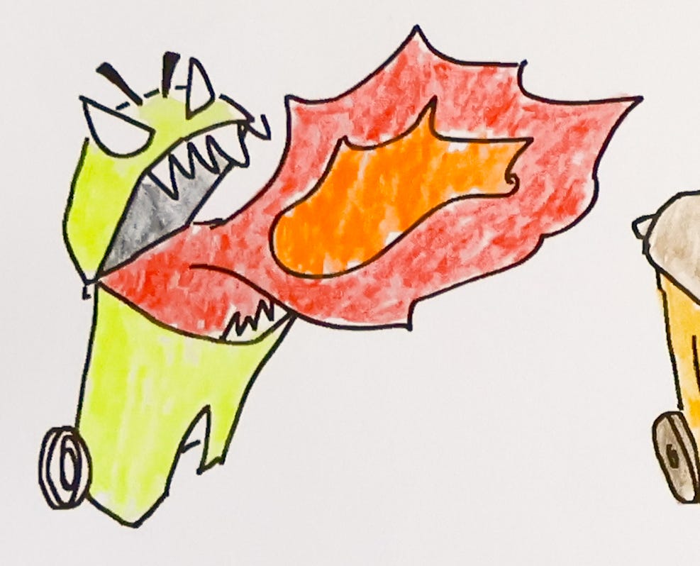
Also……. long-time readers of the vrklovespaper newsletter may remember… back in July 2023 I was trying to draw angry dinos and I couldn’t get it right.

WELL LOOK AT ME NOW
Actually illustrating the cover is even more time-consuming, labor-intensive and challenging, but there’s only 1 cover vs 60ish pages to lay out lol.
Always love your missives! I considered taking this SVA course years ago so it was incredibly fun to see your assignments—thank you for sharing them!! I also firmly believe that you "learning to speak" will make for a better Pouch, so please take the time you need 💛 and am very happy you're prioritizing both!!
Plus plus plus to everything here — I always LOVE reading about your process and perspective and feelings vrk. (And so happy to be an editor on Pouch 🥹❤️❤️ I gotta get you a pet rock and paint my face on it or something lol!!)
But this time I am most obsessed with these TRASH CANS ahhhhhh omg i love them. The blushing one and the crying/longing one are my faves. So emotive. The stickers will be excellent!!
Glad you’re taking the time you need and so proud to call you my friend and my editor-in-chief. YOU GOT THIS 💪💪