HELLO my friends!!
It’s been a while!! Maybe you noticed (or maybe not — probably not!) I skipped writing my newsletter last month! This fall I’ve stretched myself waaaaay too thin and committed to too many things, and I badly needed to let *some* things drop, so I decided to take a little rest from the newsletter 🍁 Honestly things are still really really busy, but I didn’t want to be away TOO long!! So I’m back again today to give you an update on my world right now.
And what is my world right now? POUCH ISSUE 2! I am in the weeds laying out the whole magazine. All the content is written and ready and I’ve been in heads-down design mode trying to put it all together. I’m hoping to have the entire issue done by the end of the year, sans cover + finishing touches. It’s a lot, but I’m going to give it my best shot to stay on schedule! So this is a designed-focused newsletter today, since designing Pouch is my focus for the rest of the year ✨
Hope you enjoy, and Happy Thanksgiving! 🦃
♡ vrk
Pouch Issue 2 submissions 😭💖
Submissions for Pouch Issue #2 closed last week! I invited Pouch readers to submit a picture of their journal for inclusion in Issue #2. I’ve been going through them and they are all… so…. good!!! 😭
My original plan had been to select 8-9 journals to publish in the issue, and then publish the rest online, but I did not fully think this through lol.
Now that the submissions are in, SELECTING WHICH ONES TO (NOT) PUBLISH IS IMPOSSIBLE 😭
Each one of these journals is a treasure. It takes a lot of vulnerability to share a glimpse of your journal with someone else! And as a viewer, what a privilege it is to be given access to this very personal thing, created by someone with the purest intentions.
We have around 20 submissions, and I’m gonna see if it’s feasible to print ALL OF THEM! It’s gonna take some design creativity, but I really want to find a way to honor every one of these lovely submissions.
Gosh I can’t wait to share these with you!!!!
✏️ New design process
Here’s the process I followed for producing Pouch Issue 1:
Write an article
Design the article to 100% completion (including photography, drawings, etc)
Repeat steps 1-2 for all articles
This was a very slow process!
So this time around, I’m trying a different way of working.
🌱🌱🌱🌱🌱🌱🌱🌱🌱🌱🌱🌱🌱🌱🌱🌱🌱🌱🌱🌱🌱🌱🌱🌱🌱
How I’m making Pouch Issue 2
PHASE 1: Content
Get all the articles written & collect the main content that will go into the magazine.
PHASE 2: Design & layout
Design each article, jumping between these two states:
Sketch: I make rough sketches in Figma, trying approaches of how I want to tell the story. I skip this step if I don’t feel I need it, or I jump from the layout back into sketch mode as needed.
Layout: I lay out the mostly-final design in InDesign, except I use placeholder images for most photos and graphics, and I don’t complete all the little embellishments.
PHASE 3: Photography & illustrations
Take photos and draw pictures to replace the placeholder graphics.
PHASE 4: Finishing touches
Final pass through the whole magazine, fixing up little imperfections & adding doodles, textures, etc to finish the design.
🌱🌱🌱🌱🌱🌱🌱🌱🌱🌱🌱🌱🌱🌱🌱🌱🌱🌱🌱🌱🌱🌱🌱🌱🌱
I’m liking this new process so far! Skipping the photography & illustration step until after the design step especially feels different. It really helps with momentum that I don’t have to switch from “design mode” to “photography mode” mid-article. Plus, it’s a lot easier to take photos after the design because I have a much better idea of what photos I want.
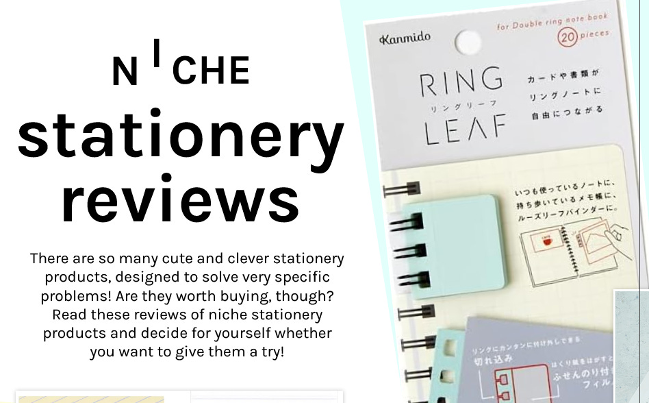
Here’s an example of what an article looks like after Phase 2:

So far so good imo! I’ll let you know my final thoughts on this process after I finish the whole issue.
🚙 Design journey: Niche Stationery
Speaking of that last layout, I want to share my tiny design journey for the title of “Niche Stationery Reviews.”
For “Niche Stationery Reviews,” I was thinking hmm… how might I make the title fun, while also communicating “niche”?
Maybe I should show a picture of a niche stationery item?

That could work if I use a photo of something I’m reviewing. But I wonder if I should try representing “niche” in an abstract way?
Middle of a venn diagram maybe?

Not bad, but it’s visually tricky (even if I used less BOLD colors in my own graphic).
How about something Tetris-y? Like “niche” representing a Tetris piece that fits exactly in a space you need.

Ehh the graphic is a bit too Tetris-y, not Stationery-y enough!
But I like what I did with the “I”!
What if we pull it back to just the “I”, which looks like it’s a Tetris piece fitting into the word “NICHE”?
Good enough for me!!!
(Note: It actually looks a liiittle plain to me 😆 but that’s a problem for Phase 4!)
🍬 Magazines like candy stores
It’s taken me a while to find helpful references when it comes to designing Pouch!
A lot of beautiful magazines — the kind you might see at McNally Jackson — stick to a similar design aesthetic: They contain pages of striking photography and stunning illustrations paired with austere columns of text.
They’re gorgeous, but they’re not what Pouch is trying to be! Both from a practical standpoint — Pouch is just me and Nikki right now, so it’s not like we have professional photographers, illustrators & a studio available — but also because these magazines feel like you’re walking through an art museum. I LOVE art museums, but I want Pouch to feel more like you’re in a kid in a candy store, or — naturally — a stationery lover in a stationery store!
For those reasons, magazines like these are not particularly helpful as design references for making Pouch:

Much more helpful would be a magazine with the energy of a snack shop! With a lot of information organized in a fun-to-snack-on sorta way. And for practical reasons, one that didn’t rely heavily on illustrations or epic photography, either.
Recently found a true gem, my new holy grail of magazine design!!!
It’s a cat travel magazine called にゃっぷる (google translate says this is “Nyapple”!!)
I stumbled upon Nyapple in the magazine section of Kinokuniya, and immediately I was like, “omg this is gonna be so helpful for Pouch”!!! I love it because it features an achievable level of photography + illustrations, with so many simple cute design elements that help the pages stay engaging.
Once Pouch 2 is more ready, I’ll show off some layouts where Pouch took inspiration from Nyapple. (I think it’s already visible in the Niche Stationery layout, too!) Of course I haven’t nearly reached the same level of Nyapple’s design mastery (YET) but it feels good to be learning from the greats 😌
Now we just need a dog version of Nyapple!! (For no other reason than, DOGS)
😤 Decision: I’M NOT USING CMYK
OK this is going into the nitty gritty specifics of making Pouch, but I gotta get this off my chest 😤
Just about anyone who has spent time designing for print, has had to wrestle with RGB and CMYK, which are two different modes of representing colors.
If you read about the difference, it seems simple enough on the surface:
RGB is for monitors!* Use RGB colors for designing for screens!
CMYK is for printers!* Use CMYK colors for designing for print!
(*This is a gross over-simplification intentionally)
But… I designed Pouch Issue 1 entirely in CMYK, and I was plagued with two problems:
1. Using CMYK in InDesign is GARBAGE
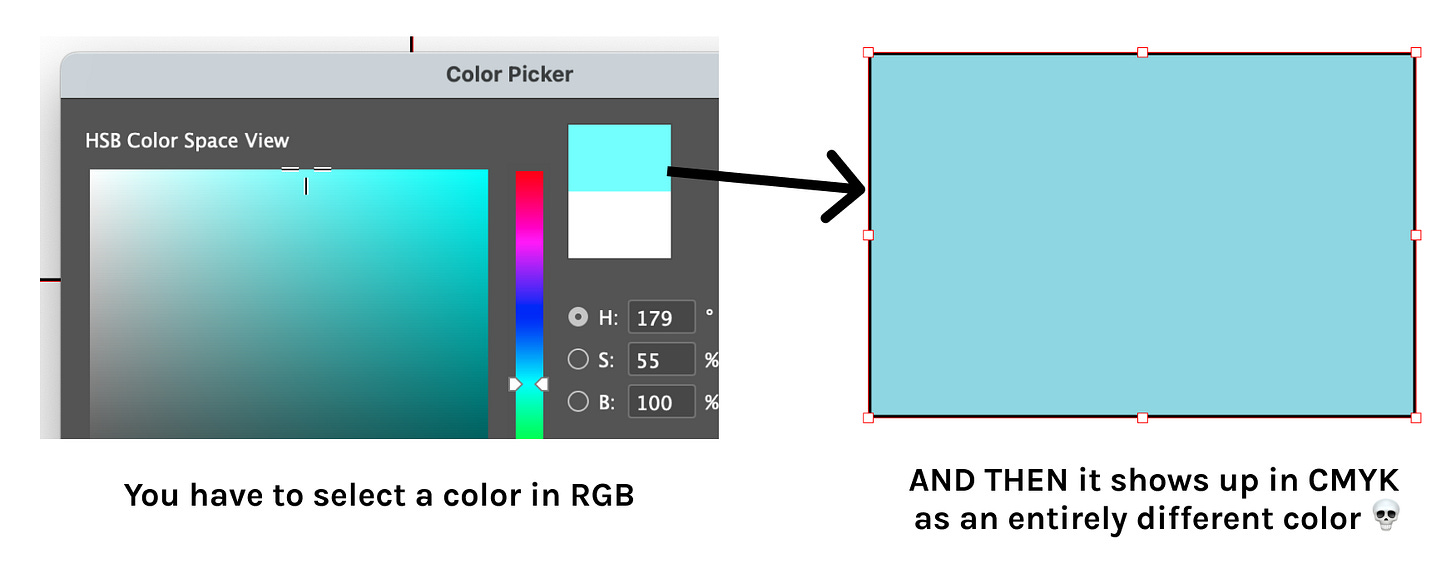
Like!!!! If you want to design in CMYK, InDesign forces you to choose colors in RGB mode, and ONLY after you’ve exited the color picker does it show you what color you “really” chose, which is a completely different color:
So to choose nice colors for your layout… you have to pick a color, exit the color picker, see what color it turned into, and if you don’t like that new color: open the color picker again, guess another color again, close the color picker, discover what the real color is, repeat….. 😭😭😭
WHY IS THE DEFAULT COLOR PICKER NOT IN CMYK
WHY
INDESIGN EXPLAIN YOURSELF
(… ok there’s actually another way to select colors in CMYK that I learned later, but it is also absurd. You can open a separate Colors panel and then use this *microscopic* color picker to select your colors in CMYK. It’s a better experience than the one above, but still bad, and still a lot of guess & check!!)
I did all 50 pages of Pouch Issue 1 suffering through this color selection experience plus other CMYK woes 😩 It was soOOooOOo slow and annoying!!
2. …And yet I still had so many color issues??
It’d be one thing if I designed everything in CMYK, used this muted limited palette, endured this awful guess-and-check experience in InDesign, and then was rewarded with highly accurate color prints.
But I wasn’t!!! 😩😩😩 The colors printed in Pouch Issue 1 are quite different from the colors in the digital files.
***
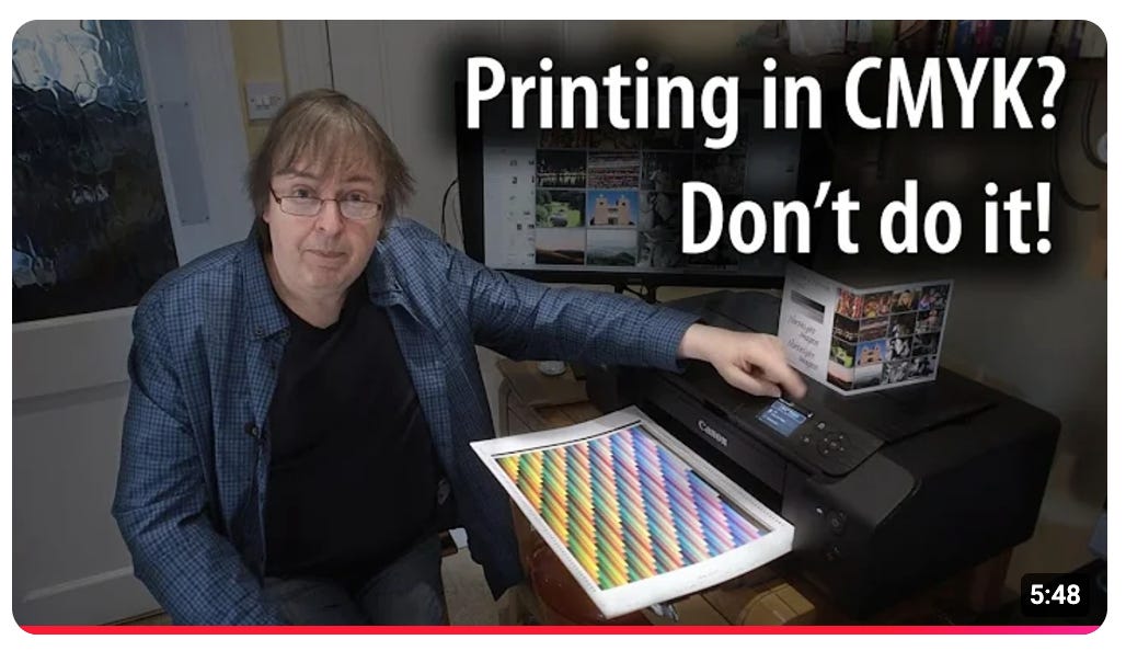
Earlier this year I did a deep dive trying to get to the bottom of this — and I cannot get into the details right now lol, it is SO complicated and confusing — but one piece of advice I found: For digital printers, some experts recommend you avoid designing in CMYK and instead just use RGB. Their reason being, the printer driver is going to do the RGB → CMYK color conversion for you, and so just let the driver do its thing.
Hear for yourself from Keith Cooper in this fine video:
My printer Mixam uses digital printing presses, which are basically giant inkjet printers as far as I understand. So the “Just design in RGB” rule of thumb should apply for my Mixam prints too… I think!
Sooo I’m just gonna see what happens if I design all of Pouch Issue 2 in RGB lolll. I’m going to do a test print in December/January anyway, so I have time to fix it if everything looks wacky. Cross your fingers!!
☀️ Some non-Pouch life updates
A LOT has happened for me outside of Pouch since my last newsletter update, too!! Here’s a quick rundown of some highlights outside of Pouching:
💍💞 Got engaged!!!!!
🎂 Turned a year older (Oct 30)
🎃 Wore two Halloween costumes
🌴 Visited friends in LA
🖼️ Visited 5 museums
✏️ Almost finished comics class
👩🏼💻 Wrote 3 software tools (1 for Chibitronics, 1 for helping me make Pouch textures, and 1 for helping me print photos for my journal) (yes another printing tool lol) (this one is much more helpful than the last few!) (will share more after Pouch Issue 2 is in good shape!!!)
toodles~
Back to Pouch now! Talk to you later, my friends!


Congrats on all the progress and amazing life updates—excited for you! 😊
Oh I neeeeed to a subscription to Nyapple posthaste. Very cool to see the layout approach/process you're taking this time.
(Soooooo excited for everything in store in Pouch Issue 2!)