


off to the printers!!
pouch issue 1 is code complete!!


Hello everyone!!
WOW, March was so busy!! There were new and exciting opportunities that came up, wonderful conversations that were had, fun parties and events and friends in town… At the same time, this was a month where I really needed to stick to my priorities, which were basically:
FINISH POUCH
(everything else)
It’s April now, and I’m relieved to say: Pouch Issue 1 is…………??
I don’t want to say “done!!!”
In software engineering, there’s a stage of a project that’s called “code complete,” when you’ve written all the code that you need for the feature, and in your own brief testing, the feature seems to work. You say you’re “code complete” though, and not “done,” because it’s not ready to be shipped out to users yet. You usually have to do way more testing, fix bugs and other problems, etc before you’re ready for launch.
There has to be an equivalent term for this for magazines, right? I don’t know what it is though, so for now we’re gonna say: Pouch Issue 1 is code complete!! 😂 Every page is finished, designed, and laid out in InDesign, and I formatted the PDF and sent off a test print order to Mixam. I should be ready to fulfill preorders soon!
Final page count: 50!!! 😱 The Pouch Preview issue was 22 pages long, so in March I basically created another Pouch & a half. Honestly it might be too long now, but we’ll see how it feels when I get the test prints!
There’s a lot to talk about in today’s newsletter, such as: A deep dive on redesigning the Pouch cover, what’s new in Pouch Issue 1, also I had a big 💡 about marketing Pouch and I sorta renamed Pouch Cafe to Pouch Studio, also I got into Stationery Fest!!!, aaaand more!
I hope you enjoy!! 🌸
♡ vrk
 Illustration")
📔 Pouch has a new cover! + Why & How

As part of my sprint to finish Pouch issue 1, I gave Pouch a totally new cover!!
I really loved my original cover, but as I used it over the last few months, I realized there were some major design issues with it:
1. It doesn’t communicate what it is
On one hand, a cover of a book doesn’t necessarily have to tell you what a book is going to be about. On the other hand, Pouch is a magazine with a target audience: Journalers and Stationery lovers. I actually got some feedback from my early preview readers about this, that the content of Pouch is quite specific, and even calling it for “paper lovers” is too broad. Being clearer on this from the very start seemed like a good idea!
The original cover is a little mysterious, like “oh, what could this be?” But since I’m targeting a specific niche, I think the cover should be super obvious in explaining what it’s about, like, “HEY HELLO HI, STATIONERY FANS?! I AM FOR YOU!!!”
2. Pouch isn’t minimal

My original cover was also a relatively minimal and clean design. But the inside of Pouch is fun and playful! I wanted my cover to reflect that!
3. The lettering was sloppy (and not a vector)

The more time I spent with these letters, the more I could see the sloppiness in their construction 😭 I really wanted to do another take at these letters with more thought and intention, and in a vector format so it was easier to reuse.
🤺 The design battle that ensued!!
Whew friends, this was NOT easy to redesign!!!
My biggest hang up was, ironically, restrictions I put in place to limit the scope of the redesign so it wasn’t too much work.
I told myself I should just incrementally improve the cover as best as I could in 1-2 days, and as part of that, I was convinced I should keep the same illustration. I can draw ~ OK ~, but I am not even close to having the skill set of a professional illustrator, so it just seemed so risky to try another cover illustration.
I tried to work with what I had and….

Sighhhh. I didn’t like anything I was coming up with.
I needed to consider redoing the cover entirely!
To try out ideas quickly and cheaply, I started using photos and illustrations from Pinterest to visually prototype what a new design could look like. This still took hours!! I was tried all sorts of concepts: Patterns, product photography, manga, classic American magazines, retro Korean fashion magazines…
Finally I mashed up my Pouch title with this sweet illustration of Miffy kimonos lol:

oooooooohhhhh
THIS was getting somewhere!! (Btw: do you notice how the colors on the right are a bit more muted from the ones on the left? THIS ADDED ANOTHER DIMENSION OF PAIN 😭 Print colors (CMYK) are sooo much more limited than screen colors (RGB) sighhh. anyway!!)
I took a moment to analyze what made this “cover” work:
A bold, trendy, limited color palette
Having people on the cover definitely makes me connect to it more
The illustration is clear and the subtitle is even clearer, “Miffy x Kimono”
I decided I needed a new illustration! Something with a person in it, and something that is more at the heart of what Pouch is about. Pouch isn’t a zine about pouches; it’s about stationery and journaling. Let’s have an illustration of a person who is journaling with her stationery!
I also decided to take a much more cautious approach to the illustration. With the original illustration, I drew it in pencil, scanned it, outlined it, colored it, and then put it in the design. Only then did I realize that the illustration was kind of awkward for the cover, but it was too late!
This time, I decided to do the illustration and the design of the cover in tandem:
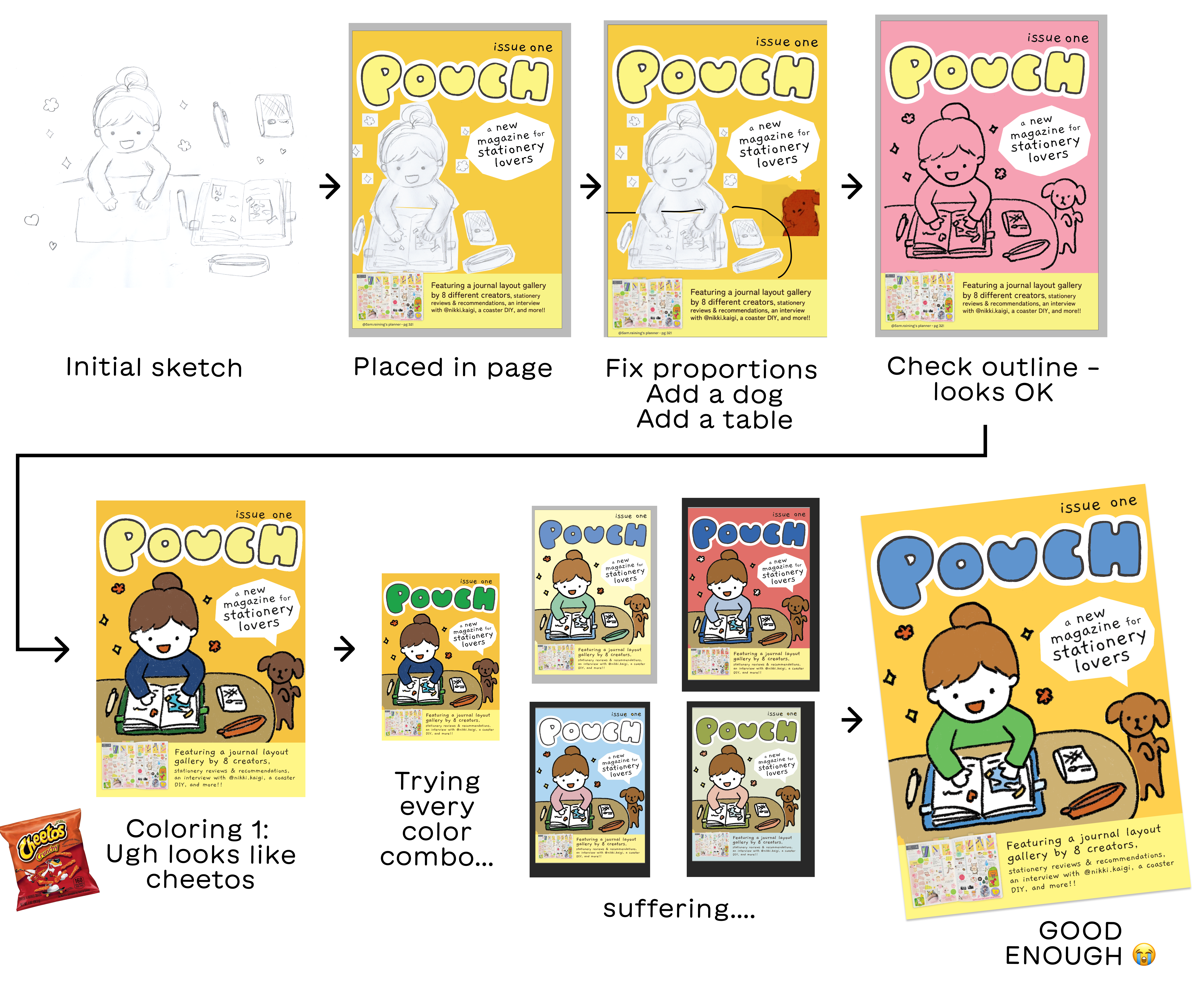
And that’s how I came to the final cover!! I’m much happier with this cover than the previous version!
(…Though I’m self-conscious about the colors I chose. 😭 Colors are so hard!!!!)
🔤 Oh yeah, the letters!!
I forgot to mention how I redid the Pouch letters! I made a go at it in Procreate first, and my very first attempted looked HORRIBLE lol.
I then watched the first 90 seconds of this video on how to do write letters in Procreate, and honestly my mind was blown 😆 He drew guidelines? He sketched out each letter first using a pencil brush??
Alright let’s give this a shot!!
Here’s a timelapse of my video from Procreate, including my horrible first try, and then the attempt with guidelines:
After this sketch, I manually converted it to a vector in Illustrator using bezier tool, then I was done. Wasn’t too bad!
🐷 Pouch is now 50 pages long
My battle with the Pouch cover, while dramatic, happened just over the course of 2 days!! The rest of March, I was finishing the other 30 pages I added to Pouch, in addition to incorporating feedback and doing the rest of what was needed to finish the magazine.
Here’s what I added:
An interview with dear friend & journaler extraordinaire, @nikki.kaigi
A 16-page journal layout gallery, featuring journals from 8 creators
A directory of recommended stationery stores

Why spend so long on Issue 1?
Plenty of folks have asked me why I am spending so much time on just issue 1 of Pouch. This is an excellent question! I could have shipped a rougher, shorter Pouch Issue 1 and continued to make improvements in Issue 2 and beyond.
However, I am NOT planning to publish Issue 2 right away — I actually haven’t committed to any regular publishing schedule for Pouch yet. Instead, I’m treating Pouch Issue 1 as a pilot of the magazine. I want to gauge interest for a magazine like this, get feedback, see what sales are like, and then make a plan for Issue 2 and beyond.
Therefore, I really want to make sure Pouch Issue 1 communicates the vision of what I’m trying to do, so that I have as meaningful of a test as possible. I could have made Pouch much less polished, but a crucial part of my vision for Pouch is the colorful, playful design. As for the additional content, my original 22-page preview issue didn’t have any community contributions, and for my vision of the magazine, the community is absolutely essential!
The other big reason I’m taking so long on Pouch Issue 1 is because this is also a project to help me strengthen my print design skills! Having an ambitious quality bar makes me have to stretch much farther and learn more.
Anyway, this plan was not without trade-offs!! 50 pages is still longer than I intended 😆 and I’m worried this is too many pages for the form factor. I’ll see how it feels when I get the test prints, though!
Regardless: Pouch Issue 1 feels finished* now (*code complete 😆) and I’m excited to soon start testing this pilot properly!
🎬 @pouch.cafe → @pouch.studio
In the last newsletter, I was struggling with marketing Pouch. After a really helpful chat with my friend Kelin, I realized a big part of my struggle was that having an Instagram for “Pouch Cafe, Zine Store” wasn’t serving me:

To put it simply:
It’s useful for me to have a home for Pouch magazine, specifically.
It’s useful for me to have a home for everything I’m doing creatively.
…But having just a zine store is a weird in-between. It’s neither specific enough to be clear and easy to explain, nor broad enough to encompass my other creative projects.
Therefore I’m in the process of reconfiguring my communication strategy!! I haven’t finished this transition because, well, Pouch Issue 1 was the #1 thing I needed to finish in March and took up the vast majority of my time. So right at this very moment, my web presence for Pouch is kind of a mess! I’ll get this all sorted out in April 😂
As a first step, though, I renamed my Instagram from @pouch.cafe to @pouch.studio 💖 It’ll be the home of all my creative projects, not just Pouch or my zines!! I have a commemorative Reel that explains, if you wanna watch 😆
I also took a stab at making https://pouch.studio/ but uhhh kind of a mess!!
🎏 Pouch at Stationery Fest!!
Friends!!! I will officially be at Stationery Fest with Pouch in August!!! 🥹
Pouch isn’t on the Stationery Fest website yet, but honestly what a blessing, because like I said in the previous section, my websites are in transition LOL. I’m gonna ask about it when I have a website I want them to link…
But I’m very very excited for this!! In addition to tabling, I’m also going to be running a few workshops about printers 😂 truly my dream!!
More on Stationery Fest in newsletters to come!! 🎊
🐰 and moree??
Substack keeps telling me “Post too long for email” so I really gotta wrap this up!! I’ll just add a few more bits of news:
I’ll be at Milwaukee Zine Fest in a few weeks!! Come say hi if you’re in the area! :D
I’m considering moving my zine store from Gumroad to Fourthwall. Gumroad has a generous offering, but I find Gumroad store UIs to be a bit confusing and also heavily Gumroad-branded. Gumroad’s discovery is also virtually nonexistent. Whereas stores on Fourthwall are a lot more modern-looking, are way more customizable, they don’t take a cut for physical orders (!!), and they support custom domains, all for free! Downsides: No discovery on Fourthwall, either, and there are some rough edges, like I keep finding typos 😭 Doesn’t exactly inspire confidence! Still, payments are handled through Stripe (i.e. I have high confidence there), and the customization is really quite good… I might try it! LMK if anyone has experience with Fourthwall, good or bad!
Have a wonderful April, everyone!! Enjoy some flowers in your area 🌸
love the new cover! very exciting that you'll be at stationery fest!!
also, in case it's helpful – for color palettes, I've found having the Riso color palette (https://www.stencil.wiki/colors) in Procreate leads to pleasing color combinations (:
woohoo!!! big congrats on getting into stationary fest especially!