Hello my friends!!!
There was a YouTube video I watched the other day called, “You Don't 'Lack Follow Through' - 5 Signs You're Self-Regulating Through Future Fantasies.” I wasn’t the target audience for this — my follow-through has been rather good these days lol — but I bring this up because I really liked how she talked about goals.
Heidi says: Any goal you pursue will have problems, challenges, failure, pain — so the objective is not, how do I obtain a life where I have no problems, but rather, do I want to trade my current set of problems for a different set of problems that are more interesting and fulfilling for me? A set of problems that makes me say, “That’s the kind of problem I want to deal with on a day-to-day basis.”
I just spent the last 6 weeks doing very little coding, and instead I focused on improving my design & drawing skills. This was incredibly uncomfortable! But as I was struggling with an illustration last week — why the heck do these colors look fine on their own but in this layout they look SO WRONG — I felt happy. I felt like, This is so hard, but this is the type of problem I want to be struggling with.
To be clear: I STILL LOVE CODING!! I’m not saying BOO CODING YAY COLORS. I have a plan for how I’m going to bring my love for software, paper, drawing & design aaaaall together someday <insert mr burns ‘excellent‘ hands pose> <why isn’t that pose an emoji yet>. Right now though, having a near-100% focus on design and drawing feels like the right priority for me.
So with that, today’s newsletter!! I wanted to cover some of my design learnings, self-study learnings, and a new project I’ve kicked off: Pouch!
I hope you’re having a wonderful October so far, and enjoy the newsletter!!
♡ vrk
📜 NEW visual essay: Revisions to my self-study curriculum and why
In mid-August, I published my self-study plan for August 16 - Sept 29. Sept 29th was last week Friday, meaning I just finished up my first “term”!! How did it go?
Well it was a wild ride, but it went well overall!! I think a crucial part of my success was in revising my design “curriculum” when it wasn’t working for me.
If you want to learn more, I wrote a new visual essay on mmm.page that covers this in great detail!
Check it out here:
✨ ➡️ https://vrk.mmm.page/fall2023curriculum_revisited ⬅️ ✨
🎨 Top 3 design learnings
I’ve been getting design mentorship from the legendary Mariam!! We’ve been doing a skill swap: I help Mariam with some engineering questions, and Mariam helps me with design. We keep discovering so many similarities between design and engineering! Still, there are some things about design that were completely unintuitive to this engineer’s brain 😂
Here are 3 of my biggest learnings so far! 📚
1.) Start by sketching designs that are VERY different from each other
I had heard that you should make many variations when you’re exploring a design, and I thought I was doing that: I would take my first design and then… change the font! Totally new design now!!! 😂
But no: In the early stages, it can make sense to make each design as different from each other as possible. Try totally different layouts. Try things that I think will look ugly, even! Mariam also suggested I make wireframes rather than the “real” layout, and to design in grayscale to avoid getting stuck in the weeds.
This was sooooo different from how I approached design before, and was sooooo helpful in stretching my thinking!!
2.) There are infinite ways to design something - and your first try is often the bad one


Mariam gave me a lot of exercises that included things like, “make 10 different versions of this design.” There was a time a few weeks ago when I made my first sketch of a layout and I seriously thought, “OK……….. but this is the only possible design for this content. How am I going to make 10 of these??”
Not only did I end up making 10+ different layouts…. BUT MY FIRST LAYOUT WAS THE WORST ONE. The one I liked the least!!
Mariam mentioned that’s quite common too: In your first sketch, you’re getting an idea on the page, then you keep going and it’s around the middle where something decent emerges.
This was MIND-blowing to me because…. in the past, I have always stopped at layout #1!!!! No wonder my designs have been so weak 😂
3.) Use references that make sense to you (esp for beginners)


Many of my designer friends have emphasized the importance of references: That you should study great design, learn from them, use them as inspiration for your designs.
I started looking at sleek, “best of design”-worthy references. But tbh, they kinda went over my head!! I didn’t know how to apply them to what I was trying to do.
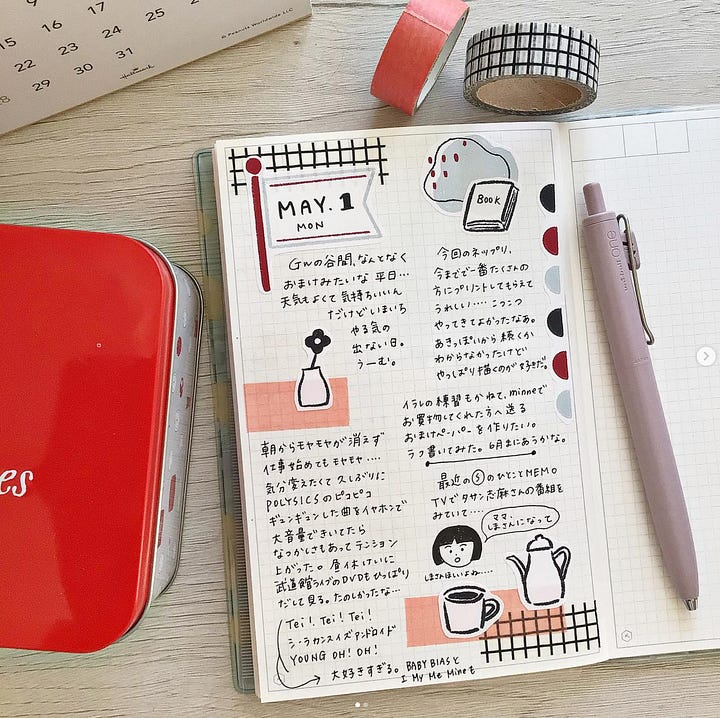
So I switched to using references that I am already super familiar with: journal layouts!! 😂 This was both much easier and much more fun for me!!!
After a few weeks of practice, I felt ready to sprinkle in design references outside of the journaling sphere. Now I can find inspiration in a wider range of sources, but I think my biggest takeaway is that I don’t have to force it, and I don’t have to emulate award-winning designs that don’t personally speak to me!
🆕 NEW project: I’m making Pouch!!! 👝


I have decided on my next big project: I’m creating a zine called Pouch, which I’m planning to launch in Spring 2024!
Concept for Pouch: A fun, engaging indie magazine that helps people connect and create with paper ✂️ It’ll cover things like reviews of notebooks, cool new stationery & stickers, essays about journaling, how-tos and DIYs and crafts, stuff like that!
I really want to try this in print as opposed to digital — not only because “paper people like paper” — but because I want to help people ACTUALLY make things. How many times do you save a cute craft or recipe on TikTok/Instagram/Pinterest and never make it? I think the first step to getting people to make things offline is to get people offline, and I have a hypothesis that a fun print magazine would be an effective way to do that.
(Though eventually…. I see a software companion to Pouch (Pouch Studio??), software to help you journal, make paper crafts, maybe even make your own indie magazine! BUT that’s in the future!! First thing’s first: The magazine!)
✅ Current status: Prototype complete!
I made a prototype! Last month I sprinted to create a small prototype of Pouch: I wrote 3-4 articles, chose one, did a ton of design exploration, drew illustrations + took photos, laid it alllll out in InDesign, and I ordered a test print off of Mixam (arriving next week!).
The purpose of this first prototype was to see:
Was it possible?
Did I enjoy making this?
Assuming 1 & 2 are a “yes”: What do I think I could ship by Spring 2024?
The answer to (1) and (2) were YES and YES!! And I’ve got a clearer answer for (3) too.
🪜 Next milestone: Pouch test issue
Since the prototype was a success, I’m moving on to my next milestone for the project: I want to create a test issue of Pouch, which I’ll hand out to friends, stationery stores, and other folks who are a potential audience for this magazine. Design-wise I want to improve the cover, and content-wise I want to include 2-3 more articles that vary in length and style.
The goal of this test is to get feedback on the content, and get a sense of how much interest there is in a product like this.
📣📣 I would love to get testers for the magazine!! 📣📣 Especially from folks who are interested in journaling, zines, paper things, DIYs, crafts, etc!
➡️ LMK if you or someone you know would be interested in receiving an early print version of Pouch, probably in November.
➡️ LMK if you know of local businesses in NYC whose customers could be good early readers of Pouch.
🎠 miscellaneous
OK I’m gonna stop apologizing for the length of these newsletters because I guess that’s just how long my newsletters are now 😂
But I WILL continue thanking you for making it this far in the newsletter!!!
I leave you once again with some fun links:
🎃 I wanna make these pumpkinnnssssss
🟨 These post its, with these stamps, with these inks, in this way… sooooo gorgeous
🌸 I found this comic lovely and moving
🛒 I WANT A STATIONERY CART
🪟 mizutama continues to be a genius


would love to be a pouch early reader as well!
your reflections on your self-study journey + the visual essay you wrote spoke a lot to me...that illustration of the wall of “you have to be a good designer” to reach your dreams reminder me of the internal walls I keep putting in front of myself 🥲 so seeing you push thru that wall and get to making pouch is so inspiring!!
also, have you explored riso printing for zines? just took a Riso class and saw a lot of zines printed at the shop I was at. I’m based in the Bay Area, but I’m aware of NYC based print shops like Risolab and Lucky Riso Graph
👋🏼 I'd like an early print version!
Here are some local businesses I can think of (but you've probably heard of them!):
* https://yosekastationery.com/ in greenpoint
* https://www.niconeco.com/ in east village
* https://eastvillagepostal.com/ in... it's in the name 😅
The prototype is looking great! 😊